- Over 70% of YouTube views come from mobile devices in 2026
- Mobile chapters display as horizontal scrolling thumbnails, showing only 2-4 at a time
- Chapter titles truncate at 25-35 characters on mobile screens
- Mobile users interact with chapters 30-40% more than desktop users
- iOS and Android show chapters identically with minor UI differences
- Mobile app chapters are more feature-rich than mobile web browser chapters
With over 70% of YouTube watch time happening on mobile devices, understanding how chapters work on mobile isn't optional—it's essential. Yet most creators optimize chapters for desktop, then wonder why mobile engagement underperforms.
The mobile chapter experience is fundamentally different from desktop. Different layout, different interaction patterns, different constraints. If you're not designing your chapters with mobile-first thinking, you're missing the majority of your audience.
This comprehensive guide covers everything you need to know about YouTube chapters on mobile devices—from how they appear to how users interact with them, plus actionable optimization strategies for maximum mobile engagement.
How Chapters Appear on Mobile
The mobile chapter experience is completely different from desktop. Here's what viewers actually see:
Mobile Chapter Display Components
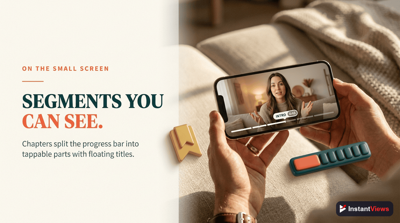
Progress Bar Markers: Small white dots appear along the video progress bar at each chapter timestamp. These provide visual navigation points.
Horizontal Thumbnail Strip: Below the video, chapters appear as scrollable thumbnail previews. Each shows a frame from that chapter.
Truncated Titles: Only 25-35 characters display before truncation with "..." The exact count depends on device width and orientation.
Current Chapter Indicator: The active chapter is highlighted with a subtle border and slightly larger size.
Scroll Behavior: Users must horizontally swipe to see all chapters. Mobile typically shows 2-4 thumbnails without scrolling.
Visual Layout Breakdown
Understanding the mobile layout helps you optimize for it:
- Portrait mode: Shows 2.5-3 chapter thumbnails at once
- Landscape mode: Shows 3.5-4 chapter thumbnails at once
- Thumbnail size: Approximately 120x68 pixels on most devices
- Title display: Single line, truncated after character limit
- Tap target: Entire thumbnail + title area is tappable
All chapters visible, full titles shown
2-4 visible, titles truncated
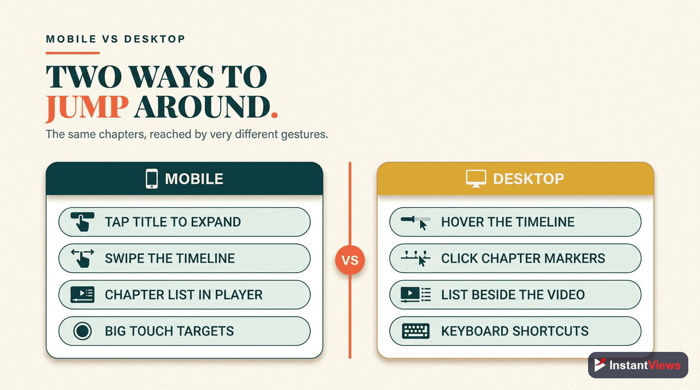
Mobile vs Desktop Navigation
Mobile chapter navigation has unique characteristics that affect how users interact:
Mobile Navigation Behaviors
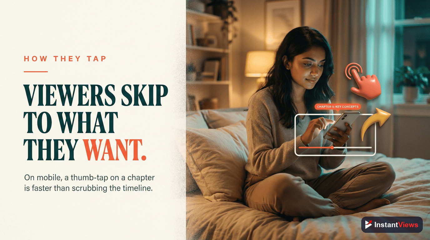
Tap-Based Navigation: Users tap chapter thumbnails rather than clicking a list. This is faster but less precise than desktop.
Gesture Conflicts: Horizontal swiping to see more chapters competes with full-screen swipe gestures. Users may accidentally enter/exit fullscreen.
Progress Bar Scrubbing: The chapter markers on the progress bar provide alternative navigation. Many mobile users prefer this over thumbnail taps.
Limited Discovery: Since only 2-4 chapters show initially, later chapters get less visibility. Front-loading important content is critical.
Key Differences Table
| Aspect | Desktop | Mobile |
|---|---|---|
| Chapter Layout | Vertical list | Horizontal scroll |
| Visibility | All chapters visible | 2-4 chapters visible |
| Title Display | Full title (up to 100 chars) | Truncated (25-35 chars) |
| Navigation Method | Click list item | Tap thumbnail or use progress bar |
| Preview Size | Larger thumbnails | Smaller thumbnails |
| Interaction Rate | Baseline | 30-40% higher |
YouTube App vs Mobile Browser
Chapters work differently depending on whether viewers use the YouTube app or mobile web browser:
YouTube Mobile App (Recommended)
- Full feature support: Progress bar markers, thumbnail previews, smooth navigation
- Better performance: Faster chapter loading and smoother transitions
- Enhanced UI: Larger thumbnails, better touch targets, refined animations
- Offline support: Chapter markers work even in downloaded videos
- Picture-in-picture: Chapters accessible even in PIP mode
Mobile Web Browser (Limited)
- Basic functionality: Chapters work but with reduced visual polish
- Smaller touch targets: Harder to tap accurately on small screens
- No progress bar markers: Desktop-style list view in some browsers
- Slower performance: Chapter navigation can feel laggy
- Browser inconsistencies: Safari, Chrome, Firefox may display slightly differently
Over 85% of mobile YouTube traffic comes from the app, not mobile browsers. Optimize primarily for the app experience, but test mobile web as a secondary consideration.
Optimize Your Videos for Mobile
Generate mobile-optimized chapters with perfect title lengths and strategic placement. Free tool, instant results.
Create Mobile Chapters →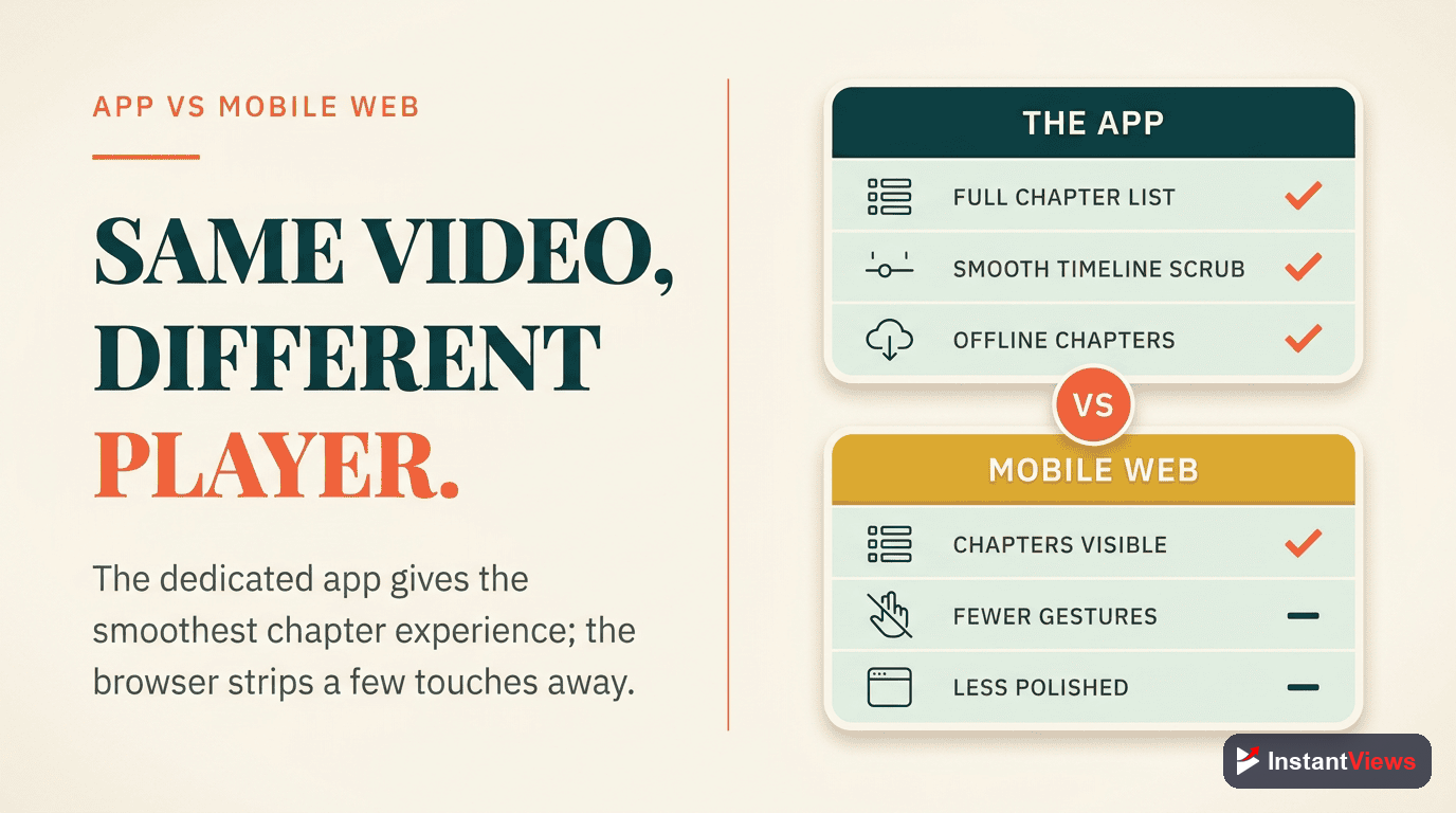
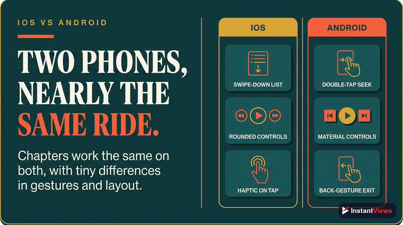
iOS vs Android Differences
While YouTube strives for platform consistency, there are subtle differences between iOS and Android:
iOS Chapter Experience
Visual Style: Slightly larger chapter thumbnails with rounded corners matching iOS design language.
Gestures: Smooth horizontal scrolling with iOS momentum physics. Edge swipes sometimes conflict with back navigation.
Typography: Uses system San Francisco font, which is slightly wider than Android's Roboto.
Performance: Generally smoother animations due to iOS optimization, especially on newer iPhones.
Android Chapter Experience
Visual Style: Slightly smaller thumbnails with Material Design aesthetics. Sharper corners.
Gestures: Android-style scroll physics. Back gesture typically doesn't conflict with chapter scrolling.
Typography: Roboto font is more condensed, potentially fitting 1-2 more characters before truncation.
Device Variation: More inconsistency across different Android manufacturers (Samsung, Pixel, OnePlus, etc.).
Practical Implications
For most creators, these differences don't require separate optimization strategies. However:
- Test your chapters on both platforms before finalizing
- Use chapter titles that work within the narrower character limit (25 chars)
- Ensure thumbnail clarity works on the smallest expected screen size
- Avoid relying on precise character counts—they vary by device and font rendering
How Mobile Users Interact With Chapters
Mobile viewing behavior differs significantly from desktop. Understanding these patterns helps you design better chapters:
Mobile Viewing Patterns
Higher Skip Rates
Visual-First Navigation
Quick Exploration
Context-Dependent Engagement
Mobile Engagement Statistics
| Metric | Mobile | Desktop |
|---|---|---|
| Chapter Navigation Rate | 42% | 30% |
| Average Chapters Viewed | 3.8 | 4.2 |
| First Chapter Tap Time | 18 seconds | 35 seconds |
| Return to Earlier Chapter | 28% | 22% |
| Full Video Completion | 31% | 38% |
Key insight: Mobile users interact with chapters faster and more frequently, but watch fewer total chapters. Design for quick decision-making and immediate value delivery.
Mobile-First Chapter Optimization
Here's how to optimize your chapters specifically for mobile viewers:
1. Title Length Optimization
Mobile truncates titles aggressively. Follow these rules:
- Maximum 30 characters: Aim for 25-30 to ensure full display on most devices
- Front-load keywords: Put the most important word first: "Settings Explained" not "How to Configure Settings"
- Avoid filler words: Skip "How to," "Guide to," etc. when space is tight
- Use numbers strategically: "5 Tips" is clearer and shorter than "Five Different Tips"
- Test truncation: Preview on actual devices before publishing
43 chars - heavily truncated
22 chars - fully visible
2. Chapter Ordering Strategy
Since mobile only shows 2-4 chapters initially, order matters immensely:
- Priority content first: Put must-see sections in positions 1-3
- Hook chapter second: Position 2 gets high visibility; make it compelling
- Summary/conclusion last: Less critical for mobile viewers who skip around
- Avoid intro chapter: Don't waste position 1 on "Introduction"—start with value
3. Thumbnail Optimization
Chapter thumbnails appear small on mobile. Optimize for clarity:
- High contrast: Ensure thumbnails are visually distinct from each other
- Avoid text in thumbnail: Won't be readable at mobile sizes
- Clear subject focus: Close-ups work better than wide shots
- Consistent style: But with enough variation to tell chapters apart at a glance
- Test at 120x68px: If it looks good at this size, it'll work on mobile
4. Ideal Chapter Count for Mobile
Mobile-optimized chapter counts differ from desktop:
- Videos under 8 min: 3-4 chapters maximum
- Videos 8-15 min: 4-6 chapters
- Videos 15-30 min: 6-8 chapters
- Videos 30+ min: 8-12 chapters (avoid going higher)
5. Mobile Testing Checklist
Before publishing, verify your chapters work well on mobile:
Test on Multiple Devices
Try Both Orientations
Verify Thumbnail Clarity
Check Title Readability
Test Navigation Flow
Create Perfect Mobile Chapters
Our AI tool automatically optimizes chapter titles for mobile display, ensuring they work perfectly on all devices.
Generate Chapters Now →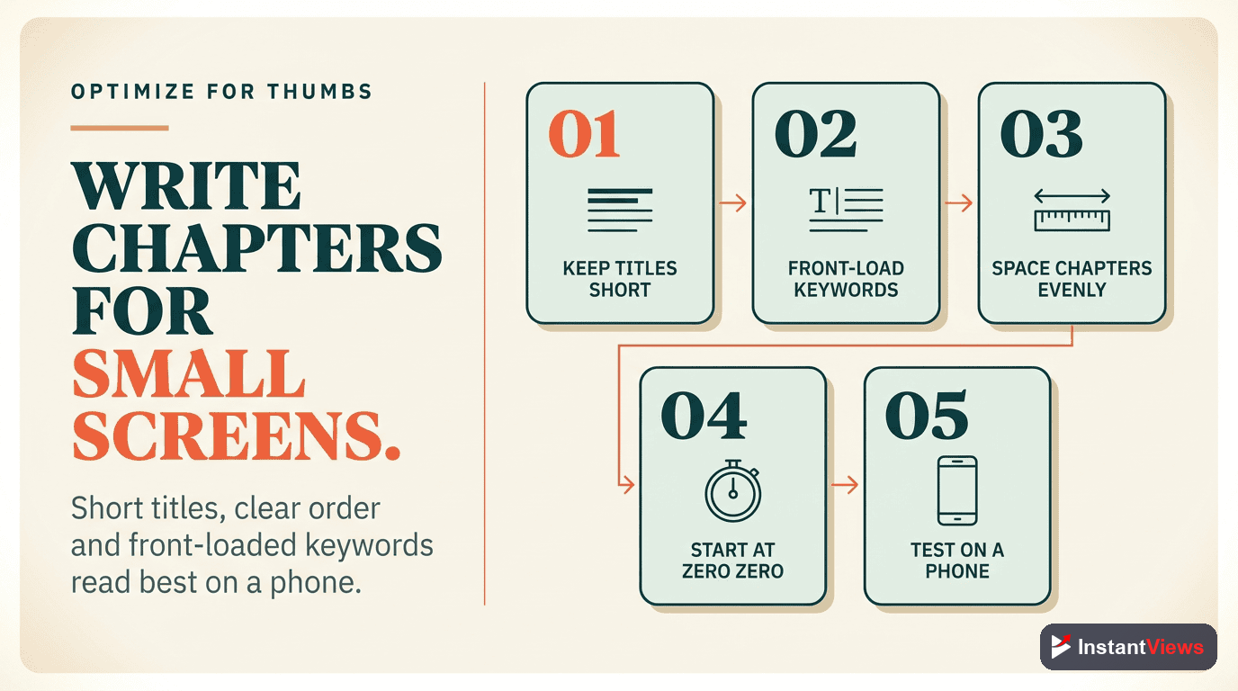
Common Mobile Chapter Mistakes
Avoid these frequent errors that hurt mobile engagement:
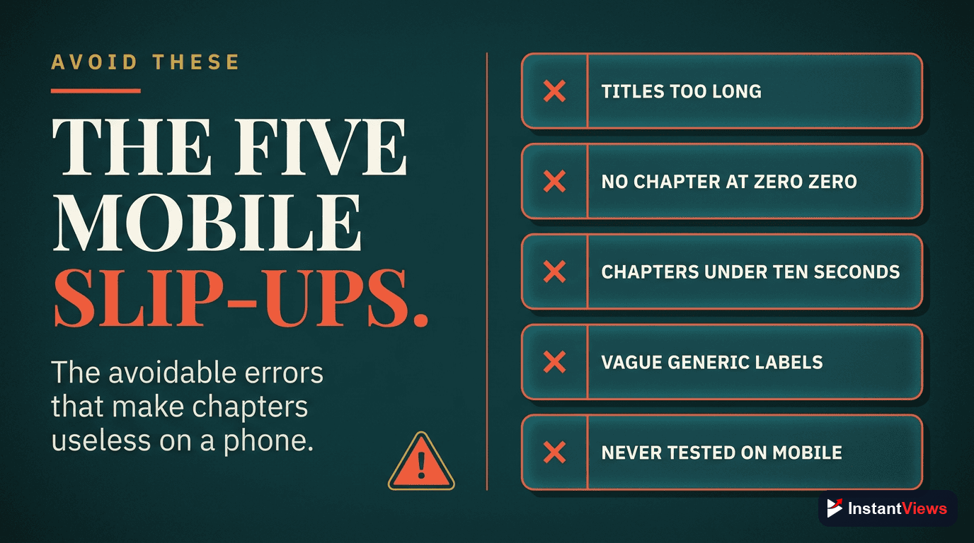
1. Desktop-Only Optimization
Creating chapters that look great on desktop but fail on mobile. Always preview on actual mobile devices before publishing.
2. Too Many Chapters
More than 10-12 chapters creates overwhelming scroll on mobile. Most viewers never reach chapters beyond position 7-8.
3. Long, Descriptive Titles
Titles optimized for desktop readability get butchered on mobile. "Complete Beginner's Guide to Understanding..." becomes "Complete Beginner's Gui..."
4. Generic First Chapters
Starting with "Introduction" or "Overview" wastes the most visible chapter positions. Start with immediate value.
5. Similar Thumbnails
When chapter thumbnails look identical at small sizes, navigation becomes guesswork. Ensure visual differentiation.
6. Ignoring Mobile Analytics
Not checking YouTube Analytics device-specific data. You might be optimizing for the wrong platform if you don't know where your views come from.
The biggest mistake is not considering mobile at all. If 70%+ of your views come from mobile (check Analytics), mobile optimization should be your primary focus, not an afterthought.
Advanced Mobile Chapter Strategies
Pattern Breaking for Attention
Mobile users scroll quickly. Create one visually distinct chapter (different color scheme, unique thumbnail) to break the pattern and draw attention to key content.
Mobile-First Naming Convention
Develop a consistent naming pattern that works within mobile constraints:
- Action + Subject: "Setup Camera" (13 chars)
- Number + Noun: "3 Essential Tips" (17 chars)
- Question format: "Why This Matters?" (17 chars)
- Single keyword: "Settings" (8 chars) when paired with clear thumbnail
Progressive Complexity
Order chapters from simple to complex. Mobile users often start watching, get interrupted, and return later. Front-loading value ensures they get something useful even from partial viewing.
Frequently Asked Questions
Yes, significantly. Mobile chapters appear as horizontal scrolling thumbnails below the video with truncated titles. Desktop shows a vertical list with full titles. Mobile also displays chapters in the progress bar with visible markers.
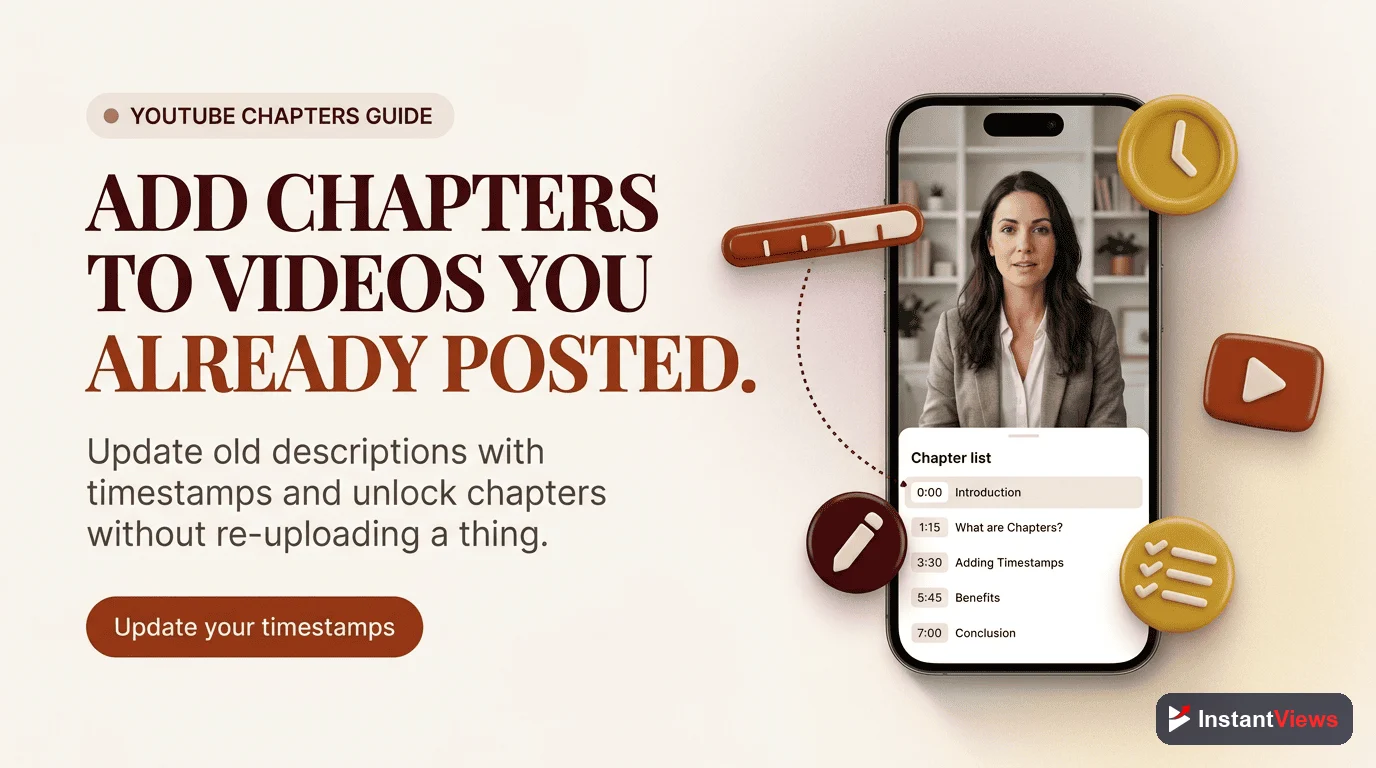
You can add chapters from mobile, but it's more cumbersome. In the YouTube app, you need to edit description through YouTube Studio mobile app. Most creators find it easier to add chapters from desktop, though they work equally well once added.
Both support chapters, but the app implementation is superior. The YouTube app shows chapter markers in the progress bar and provides smoother navigation. Mobile browser chapters are more basic, similar to desktop experience.
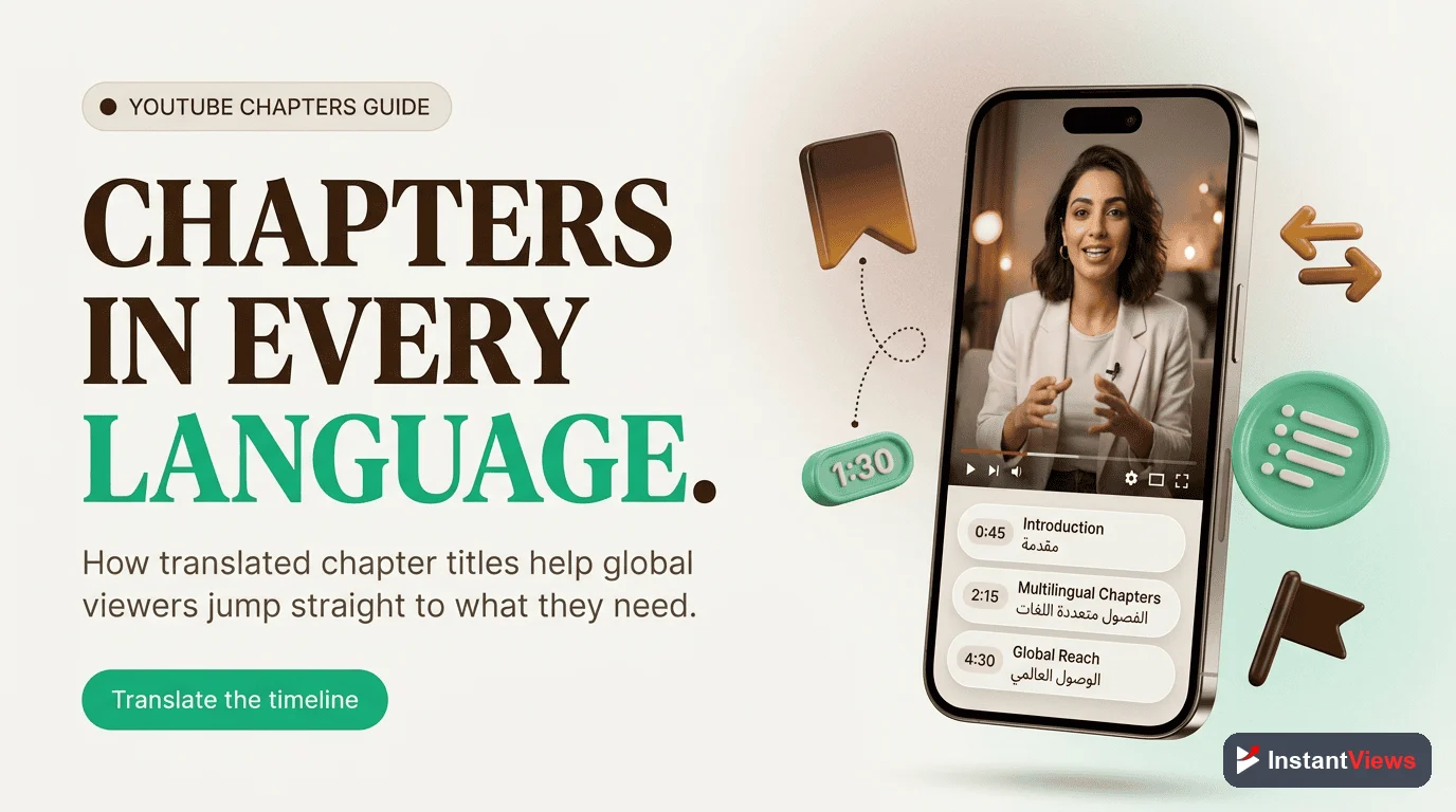
Mobile displays approximately 25-35 characters depending on device width and orientation. Titles are truncated with "..." if longer. This is why front-loading important keywords is critical for mobile optimization.
The core functionality is identical, but there are minor UI differences. iOS chapter thumbnails are slightly larger, and gesture behaviors differ slightly. Both platforms show chapters equally well, and navigation works the same way.
No, mobile displays 2-4 chapter thumbnails at a time depending on screen size. Users must horizontally scroll to see all chapters. This is why your first 3-4 chapter titles are most important for mobile discovery.
Mobile users actually interact with chapters more frequently. Data shows 30-40% higher chapter navigation rates on mobile, likely because chapters make it easier to navigate on smaller screens where scrubbing is less precise.
Yes, absolutely. Keep chapter titles under 30 characters, ensure critical chapters appear first, use high-contrast chapter thumbnails, and test how your chapters appear on various mobile screen sizes before publishing.
Final Thoughts
Mobile optimization isn't optional anymore—it's the primary experience for most YouTube viewers. By understanding how chapters work on mobile devices and designing with mobile-first principles, you can dramatically improve engagement, watch time, and viewer satisfaction.
Key principles for mobile chapter success:
- Brevity wins: Keep titles under 30 characters, period.
- Visual clarity matters: Thumbnails must be distinguishable at 120x68 pixels
- Front-load value: First 3-4 chapters get 80% of mobile chapter taps
- Test religiously: What looks good on your desktop means nothing; test on actual mobile devices
- Monitor mobile analytics: Track device-specific engagement to refine your approach
The creators winning on YouTube in 2026 are those who design for mobile first, then adapt for desktop—not the other way around. With chapters, this means shorter titles, fewer total chapters, strategic ordering, and relentless testing on the devices where most viewers actually watch.
Start implementing these mobile-first chapter strategies today, and you'll see immediate improvements in mobile engagement metrics.
Related guides:
- Best YouTube Chapter Title Length (2026 Data)
- How to Add Chapters to YouTube Videos
- YouTube Chapters Not Working? Complete Troubleshooting Guide