- Thumbnails drive 90% of click decisions - your CTR depends almost entirely on thumbnail quality
- High-contrast colors, minimal text (3-5 words), and expressive faces increase CTR by 40-60%
- 70% of YouTube views happen on mobile - always design for small screens first
- The rule of thirds and visual hierarchy guide viewer attention to key elements
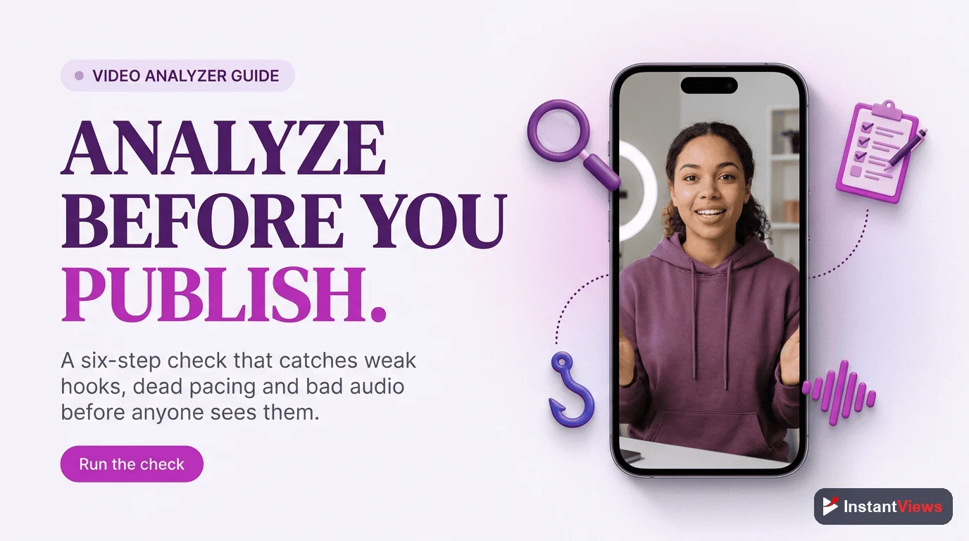
- Test thumbnails with the InstantViews Video Analyzer before uploading to predict performance
Your thumbnail has one job: make someone click. It doesn't matter how good your content is if no one watches it. YouTube data shows that thumbnails influence 90% of click decisions.
The difference between a 2% CTR and an 8% CTR can mean the difference between 10,000 views and 40,000 views on the same video. That's the power of an optimized thumbnail.
This guide breaks down the design principles, psychology, and technical specifications that separate high-performing thumbnails from ones that get scrolled past.
Why Thumbnails Control Your Success
YouTube's algorithm prioritizes click-through rate (CTR) heavily in the recommendation system. A video with higher CTR gets exponentially more impressions than one with lower CTR, even if the lower CTR video has better watch time.
Here's what the data reveals:
- 90% of viewers make click decisions based on thumbnail first, title second
- Videos with optimized thumbnails see 40-60% CTR increases
- A 1% improvement in CTR can result in 30-50% more total views
- 70% of YouTube views happen on mobile, where thumbnails are tiny
Never use YouTube's auto-generated thumbnails. They're random screenshots that give viewers no reason to click. Always upload a custom thumbnail designed specifically to convert.

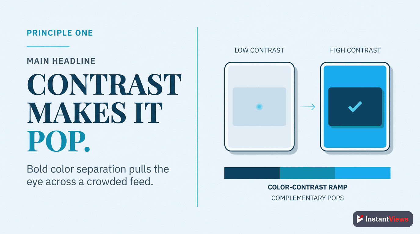
Principle #1: High-Contrast Colors
High-Contrast Colors
Your thumbnail competes with hundreds of others on screen simultaneously. High-contrast color combinations make yours stand out instantly against YouTube's white or dark backgrounds.
Yellow/Purple, Orange/Blue, Red/Cyan, Green/Magenta. Use the 60-30-10 rule: 60% dominant color, 30% secondary, 10% accent.
Why it works: The human eye is drawn to contrast. In a sea of similar-looking thumbnails, high contrast creates visual pop that stops the scroll.
Color psychology tips:
- Red/Orange: Energy, urgency, excitement (great for entertainment)
- Blue: Trust, calm, authority (educational content)
- Yellow: Optimism, attention-grabbing (how-to videos)
- Purple: Creativity, luxury (creative/artistic content)
- Green: Growth, health, money (finance, wellness)
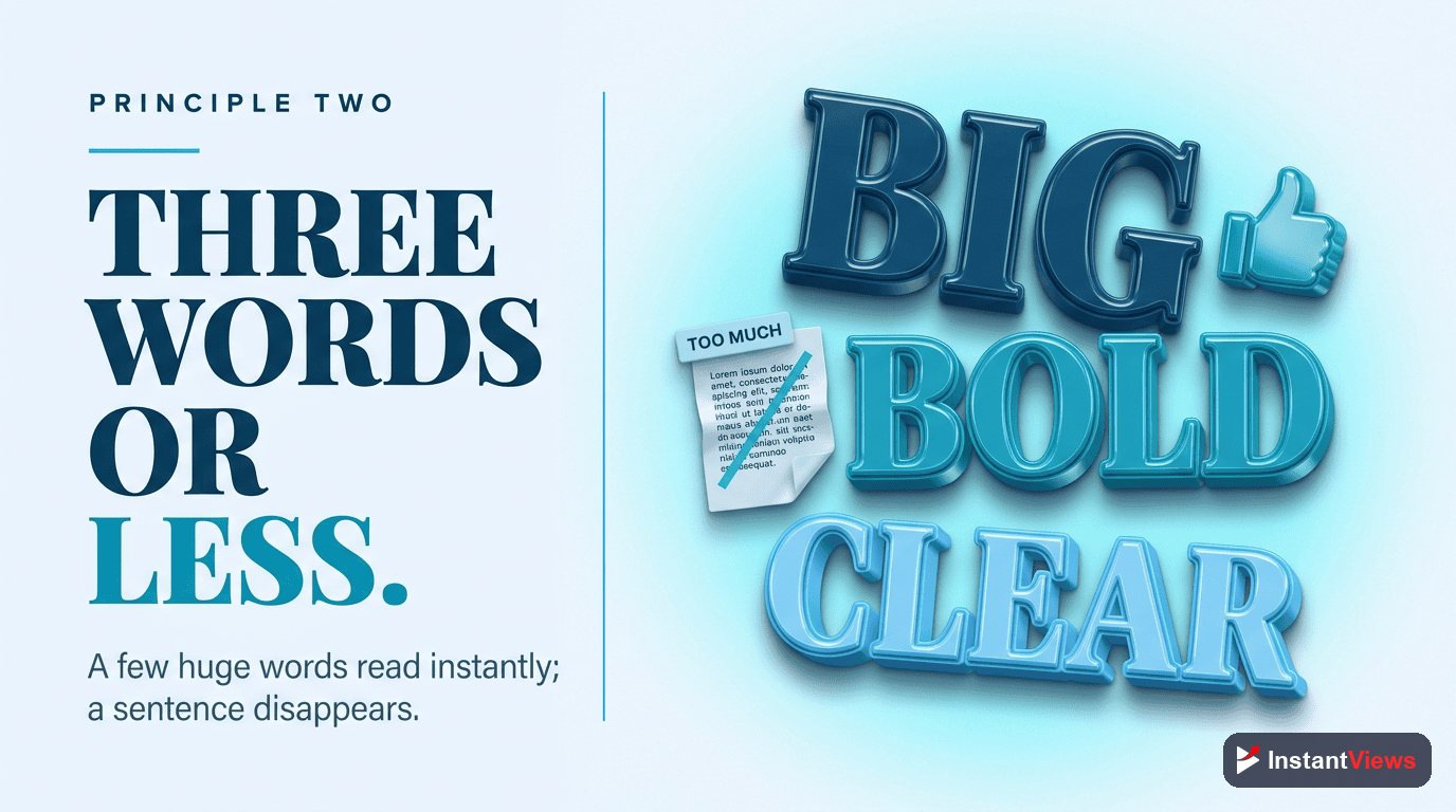
Principle #2: Minimal, Bold Text
Minimal, Bold Text
Text should be large, bold, and limited to 3-5 words maximum. It should complement your title, not repeat it. Think of text as additional intrigue, not explanation.
Title: "How I Grew to 100K Subscribers in 6 Months" | Thumbnail Text: "6 MONTHS" or "100K" - not the full title.
Why it works: Viewers scan thumbnails in milliseconds. Concise text communicates value instantly without overwhelming.
Text best practices:
- Use impact fonts: Bebas Neue, Montserrat Bold, Futura Extra Bold
- Add text outlines: 8-12px white or black stroke for readability
- Test at mobile size: Text should be readable at 320x180 pixels
- Strategic placement: Bottom third or upper corners - avoid center
- Contrast is king: Light text on dark backgrounds, dark text on light
"I reduced my thumbnail text from 12 words to 3. My CTR jumped from 3.2% to 7.8% overnight." - Ali Abdaal
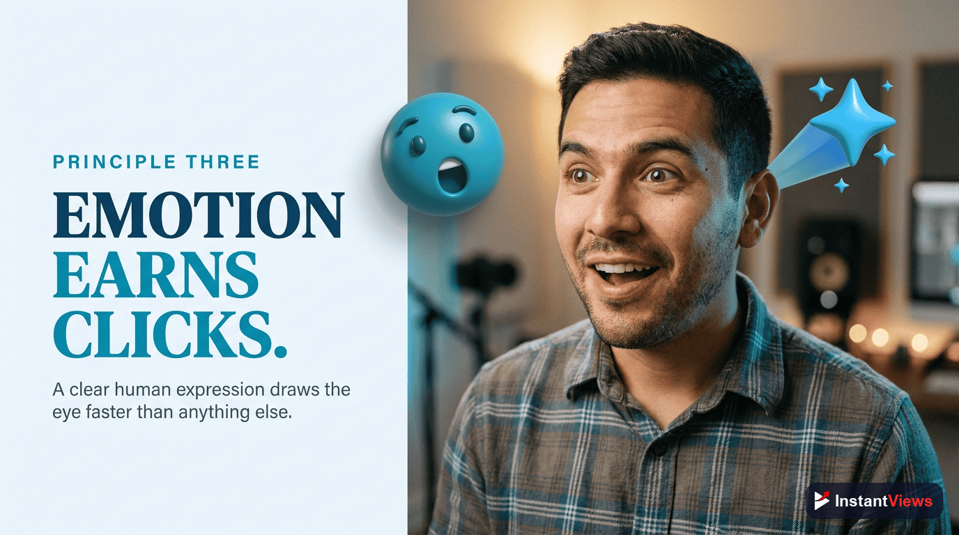
Principle #3: Expressive Faces
Expressive Faces
Human faces with exaggerated emotional expressions increase CTR by 20-40%. Emotions should be authentic and match your video's tone - surprise, excitement, shock, or intense focus.
Shocked/surprised (mouth open), excited (big smile, wide eyes), intense focus (serious gaze), confused (raised eyebrow), disappointed (frown).
Why it works: Mirror neurons in the brain make us unconsciously mimic emotions we see. Expressive faces create instant emotional connection.
Face photography tips:
- Make eye contact with the camera (direct viewer connection)
- Exaggerate expressions 20-30% more than feels natural
- Use high-quality lighting - ring lights or softboxes work best
- Position your face in the left or right third (not dead center)
- Make your face large - at least 40% of the thumbnail
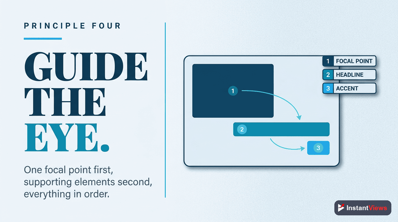
Principle #4: Visual Hierarchy
Visual Hierarchy
Use the rule of thirds to position key elements. Viewers' eyes naturally follow a Z-pattern (top-left → top-right → bottom-left → bottom-right). Place your most important element where eyes land first.
1. Face/main subject (largest), 2. Text (medium, high contrast), 3. Supporting graphics (smallest). Each element should have clear visual weight.
Why it works: Structured hierarchy guides attention and prevents visual chaos. Viewers process organized information faster.
Composition guidelines:
- Rule of thirds: Divide thumbnail into 9 sections; place subjects at intersections
- Size = importance: Larger elements get noticed first
- Negative space: Don't fill every pixel - give elements room to breathe
- Directional cues: Use arrows, pointing fingers, or gaze direction to guide eyes
- Depth layering: Foreground, mid-ground, background create visual interest
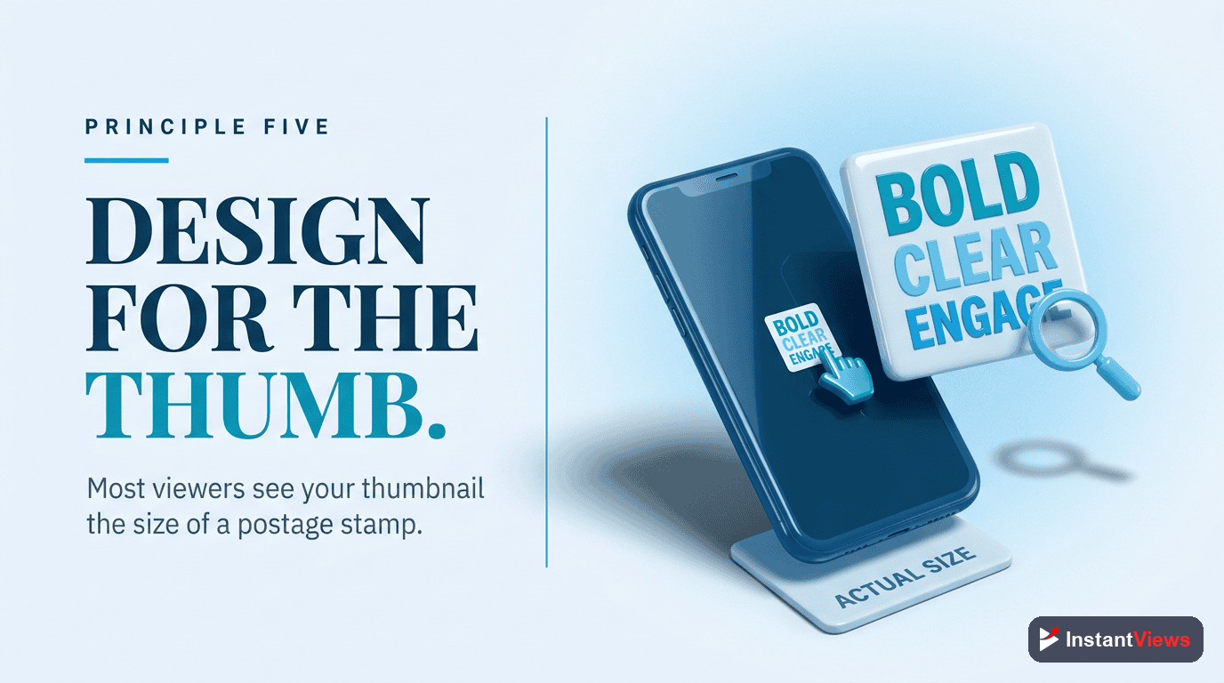
Principle #5: Mobile-First Design
Mobile-First Design
70% of YouTube views happen on mobile devices. Design at small sizes first, then scale up. If your thumbnail doesn't work at 320x180 pixels, it doesn't work.
Before finalizing, shrink your thumbnail to phone size. Can you identify the subject in 1 second? Can you read the text? If not, simplify.
Why it works: Designing for desktop and hoping it works on mobile is backwards. Mobile-first ensures clarity at all sizes.
Mobile optimization checklist:
- Text must be 60pt minimum (80-100pt ideal)
- Maximum 3 visual elements (face + text + 1 graphic)
- High contrast ratio: at least 4.5:1 between foreground/background
- Test in grayscale - if it works without color, it definitely works with it
- Avoid fine details - they disappear at small sizes
Principle #6: Curiosity Gap
Curiosity Gap
Show enough to create interest, but not so much that viewers feel satisfied without clicking. Tease the outcome without revealing the process. This is the art of visual storytelling.
Bad: Showing the complete finished product. Good: Showing the dramatic before/after split or just the "after" with "HOW?" text.
Why it works: The curiosity gap exploits the brain's need for closure. When you open a loop visually, viewers click to close it.
Curiosity techniques:
- Before/After splits: Show transformation without explaining how
- Partial reveals: Show 70% of something intriguing, hide 30%
- Unexpected juxtapositions: Combine unrelated elements that create questions
- Reaction shots: Show someone reacting dramatically to something off-screen
- Number teases: "$10,000?" or "Day 47" without context
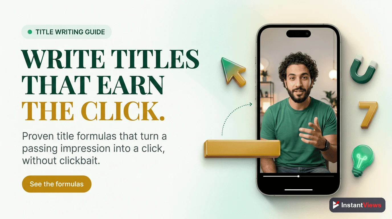
Score Your Thumbnail Before Publishing
Get instant feedback on thumbnail design, predicted CTR, and specific improvement recommendations with our Video Analyzer.
Analyze Your Thumbnail →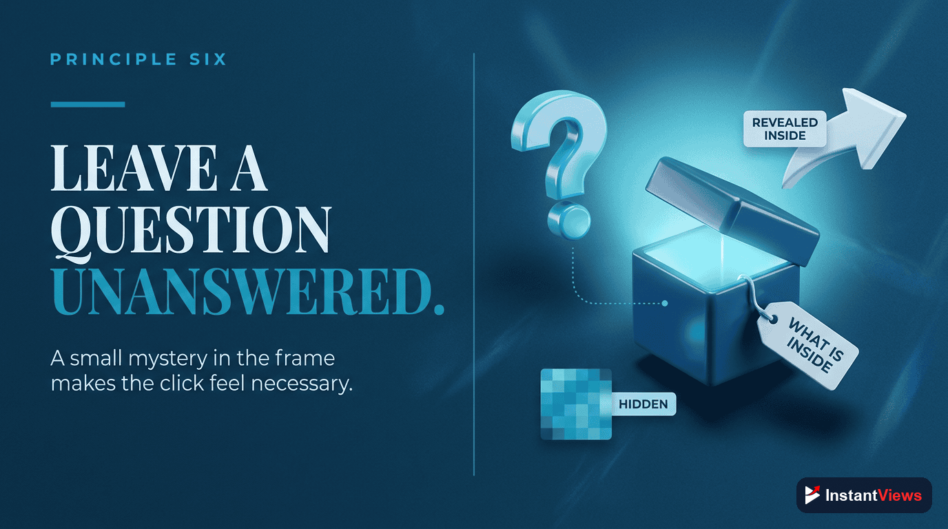
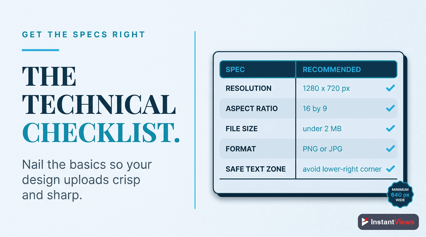
Technical Specifications
YouTube has specific technical requirements for thumbnails. Here's everything you need to know:
| Specification | Requirement | Recommendation |
|---|---|---|
| Resolution | 1280x720 pixels minimum | 1280x720 (perfect for all displays) |
| Aspect Ratio | 16:9 | Always use 16:9 |
| File Size | 2MB maximum | Under 200KB for faster loading |
| File Format | JPG, PNG, GIF, BMP | PNG for graphics, JPG for photos |
| Color Space | RGB | sRGB color profile |
| Safe Zone | Avoid critical elements in bottom-right | Timestamp overlay covers this area |
Design Software Recommendations
- Canva (Free/Paid): Templates, easy interface, perfect for beginners
- Photoshop (Paid): Professional control, best for advanced designers
- Figma (Free/Paid): Collaborative design, great for teams
- Photopea (Free): Browser-based Photoshop alternative
- GIMP (Free): Open-source alternative to Photoshop
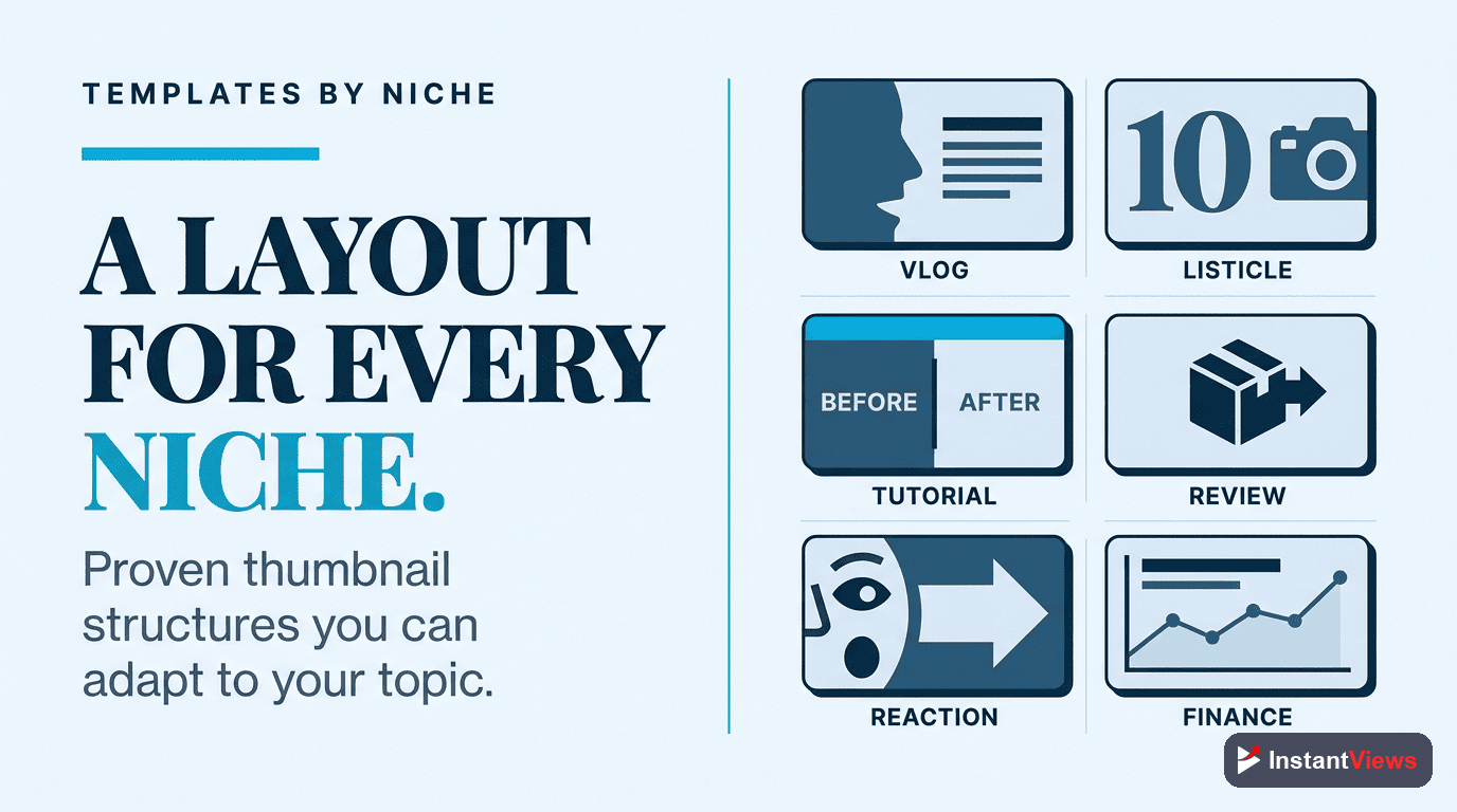
Thumbnail Templates by Niche
Different content types benefit from different thumbnail styles. Here's what works best for each niche:
| Content Type | Best Template Style | Key Elements |
|---|---|---|
| Tutorials | Before/After Split | Clear result preview, numbered steps, bright colors |
| Vlogs | Expressive Face + Text | Emotion-driven face, context text, lifestyle background |
| Gaming | Action Shot + Reaction | Gameplay screenshot, excited face reaction, neon colors |
| Educational | Infographic Style | Data visualization, clean fonts, trust-building colors (blue) |
| Reviews | Product + Rating | Product image, star rating/score, thumbs up/down |
| Entertainment | Shocked Face + Mystery | Extreme expression, question text, high contrast |
Common Thumbnail Mistakes to Avoid
- Too much text: More than 5 words becomes unreadable on mobile
- Low contrast: Similar colors blend together and get ignored
- Cluttered design: Too many elements compete for attention
- Misleading visuals: Clickbait damages long-term channel trust
- Repeating the title: Thumbnail should add new information, not duplicate
- Poor image quality: Blurry, pixelated, or dark photos look unprofessional
- Generic stock photos: Viewers recognize stock images and scroll past
- No consistency: Every thumbnail looks different (no brand recognition)
Extreme clickbait thumbnails might get initial clicks, but if viewers leave quickly (low retention), YouTube's algorithm will stop recommending your videos. Always deliver on your thumbnail's promise.
Creating a Consistent Thumbnail Style
Top creators maintain visual consistency across thumbnails. This builds brand recognition and increases CTR from existing subscribers.
Consistency elements:
- Same font family across all thumbnails
- Recurring color palette (2-3 primary colors)
- Similar composition layout (face placement, text position)
- Consistent graphic style (flat design, realistic, illustrated)
- Branded watermark or logo in the same position
"Your thumbnail is a promise. Your video is the fulfillment. If they don't match, viewers leave and the algorithm punishes you." - Paddy Galloway
Frequently Asked Questions
High-CTR thumbnails combine contrast (bright colors against backgrounds), curiosity (teasing without revealing everything), clarity (readable text and clear subject), and emotion (faces showing strong reactions or intriguing visuals). The best thumbnails stand out in search results and communicate value instantly.
YouTube thumbnails should be 1280x720 pixels (16:9 aspect ratio) with a maximum file size of 2MB. Use PNG or JPG format. Always design with mobile in mind since 70% of YouTube watch time happens on mobile devices where thumbnails appear much smaller.
Use 3-5 words maximum. Text should be large, bold, and readable on mobile screens. Avoid duplicating your title exactly - instead, complement it with additional context or intrigue. Test your thumbnail at phone size to ensure text is legible.
Yes, if done right. Faces with strong, exaggerated emotions (surprise, excitement, shock) increase CTR by 20-40%. The key is authentic, engaging expressions - not forced or fake-looking reactions. Position your face prominently and make eye contact with viewers.
High-contrast color combinations like yellow/purple, red/cyan, or orange/blue perform best. Avoid reds and whites that are too bright (they get clipped). Use the 60-30-10 rule: 60% dominant color, 30% secondary color, 10% accent color for visual balance.
YouTube allows thumbnail changes, and the algorithm tracks CTR over time. Upload with your primary thumbnail, then after 24-48 hours, change it and compare CTR in Analytics. Use the InstantViews Video Analyzer to score thumbnails before testing them live.