- YouTube Studio Analytics is organized into five reports — Overview, Content, Engagement, Audience, and Research — and each answers a different question about your channel
- Read the dashboard in order: how am I doing, how do viewers find me, do they keep watching, who are they, and what should I make next
- Click-through rate and traffic sources live in the Content tab; average view duration and the retention graph live in Engagement
- Compare every metric to your own channel average and to the video’s traffic source, not to a single universal benchmark
- Turn each report into one decision, then run a simple weekly review instead of refreshing the dashboard every hour
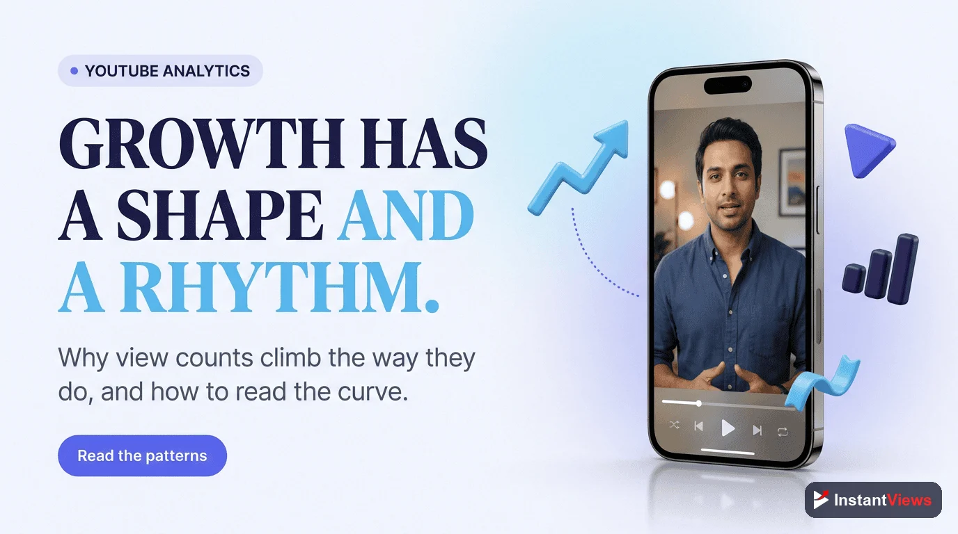
Opening YouTube Studio Analytics for the first time can feel like sitting in an airplane cockpit. Dozens of numbers, graphs, and percentages all compete for your attention, and it is easy to walk away knowing your view count went up without understanding why — or what to do about it. The good news is that the dashboard is far more organized than it looks. Once you know what each tab is for, the numbers stop being noise and start being a set of clear, answerable questions.
This guide is a navigation manual, not a glossary. Instead of listing every advanced metric YouTube offers, it walks you through the dashboard the way a seasoned creator actually reads it: tab by tab, report by report, with a single question in mind for each. By the end you will be able to open any channel or video, glance at the right report, and know exactly what the data is telling you to do next.
We will move through the Overview, Content, Engagement, Audience, and Research tabs in the order a pro reads them, decode the most important report in each, and finish with a repeatable weekly review you can run in fifteen minutes. With more than 2.7 billion people watching over a billion hours of video a day, the difference between a stalled channel and a growing one is rarely the idea — it is how well the creator reads the feedback their audience is already giving them.
One thing to keep in mind throughout: the 2026 algorithm optimizes for viewer satisfaction and retention. That single fact shapes how you should read every report below. Discovery metrics tell you whether people clicked; retention metrics tell you whether they were glad they did. The second matters more.
- Where to Find Analytics and How It Is Organized
- The Overview Tab: Your Channel at a Glance
- The Content Tab: How Viewers Find You
- The Engagement Tab: Do Viewers Keep Watching?
- Reading the Audience Retention Graph
- The Audience Tab: Who Is Watching and When
- The Research Tab: What to Make Next
- Which Tab Answers Which Question
- Your Weekly Analytics Review
- Common Mistakes When Reading Analytics
- FAQ
Where to Find Analytics and How It Is Organized
Everything starts in YouTube Studio. Sign in, go to studio.youtube.com, and click Analytics in the left-hand menu. What opens is your channel-level dashboard. You can also open any single video, click its Analytics button, and see the exact same set of reports scoped to just that video — an essential habit, because channel averages can hide what one specific upload is doing.
The dashboard is split into tabs that group related reports together. While YouTube occasionally renames or reshuffles them, the structure has stayed consistent: a high-level Overview, a discovery-focused Content tab (which surfaces the reach reports), an Engagement tab for watch behavior, an Audience tab for who is watching, and a forward-looking Research tab for planning. Monetized channels also see a Revenue tab.
Two controls sit above every report and quietly change everything you see. The first is the date range picker in the top corner — the last 28 days is the default, but you can compare periods or look at a video’s entire lifetime. The second is the Advanced mode button, which opens a full table where you can sort, filter, and combine metrics. For day-to-day reading you rarely need Advanced mode, but it is invaluable when you want to answer a precise question.

The Overview Tab: Your Channel at a Glance
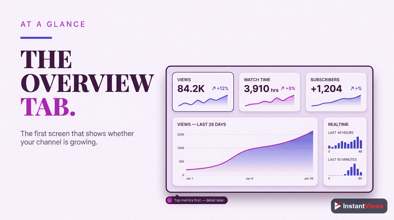
The Overview tab is the dashboard’s front page. It shows your channel’s vital signs — total views, watch time in hours, and subscribers gained — along with a trend chart and a list of your recent and top-performing videos. Read it the way a doctor reads vital signs: not to diagnose, but to decide where to look closer.
The most useful element here is the Realtime card and the “Top videos” list. Realtime shows views over the last 48 hours and is handy right after publishing, while the top-videos list tells you which content is carrying your channel. The question to ask the Overview tab is simple: Is anything unusual happening, up or down? If a video is outperforming, that is your cue to open its individual analytics and learn why. If the trend is sliding, that is your cue to dig into the Content and Engagement tabs.
Resist the urge to make decisions from the Overview tab alone. It is a summary, and summaries hide the cause. Its job is to point you toward the report that holds the answer, not to be the answer itself.
The Content Tab: How Viewers Find You
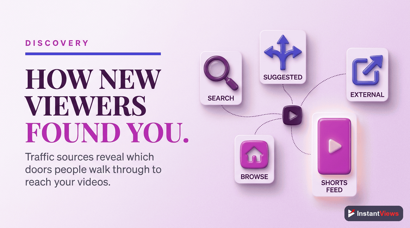
If the Overview tab tells you what happened, the Content tab tells you how viewers arrived. This is the home of the discovery funnel, and it contains the three reports that decide whether your videos ever get a fair chance: impressions, click-through rate, and traffic sources.
Impressions and Click-Through Rate
Impressions count how many times YouTube showed your thumbnail to someone. Click-through rate (CTR) is the percentage of those impressions that turned into a click. Together they form the top of your funnel: YouTube offers your video to people, and your title and thumbnail decide whether they bite.
Across most niches, the average YouTube CTR in 2026 sits between 2% and 10%, and YouTube has historically confirmed that the majority of channels fall in that range. But the headline number is less useful than the comparison. Look at CTR by traffic source: click-through from Browse reflects how appealing your thumbnail is to a cold audience, while CTR from your Subscriptions feed reflects loyalty. A video can have a mediocre overall CTR and a brilliant one among subscribers — that tells a very different story.
Traffic Sources
The traffic sources report is one of the most decision-rich screens in all of analytics. It breaks down where your views actually come from:
- YouTube Search: viewers finding you through search queries — a sign your titles and descriptions match real demand.
- Browse Features: views from the homepage, subscription feed, and similar surfaces — the algorithm actively pushing your video.
- Suggested Videos: views from the sidebar and the screen after another video — a sign you are riding the slipstream of related content.
- External: views from outside YouTube, such as social media, blogs, or embedded players.
The mix matters more than any single number. A search-heavy video has a long shelf life; a Browse-heavy spike may fade quickly. Knowing the source tells you what kind of video you actually made and how to repeat or sustain its success.
A low CTR is not always a thumbnail problem. If a video is being shown to the wrong audience through Browse, even a great thumbnail will be ignored. Before redesigning artwork, check the traffic source and the audience report — sometimes the fix is a clearer title, not a flashier image.
The Engagement Tab: Do Viewers Keep Watching?
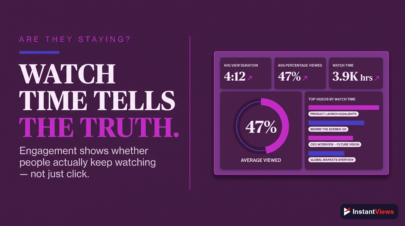
Getting the click is only half the battle. The Engagement tab answers the question the 2026 algorithm cares about most: once people press play, do they stay? This is where watch time, average view duration, and audience retention live, and reading them well is the single biggest upgrade most creators can make.
Watch Time vs. Average View Duration
These two are easy to confuse but measure different things. Watch time is the total minutes everyone watched, so it naturally grows with views — it reflects scale. Average view duration is how long a typical session lasts, and its sibling average percentage viewed expresses that as a share of the whole video. A ten-minute video with a six-minute average view duration is holding attention far better than a two-minute video that loses people at the thirty-second mark, even if the short video has more total watch time.
The pro move is to judge a video by its average percentage viewed first, because that number is independent of how many people saw it. High percentage viewed plus rising impressions is the combination that tells YouTube to keep recommending a video — and when CTR and average view duration are both above your benchmark, the algorithm tends to amplify the video further.
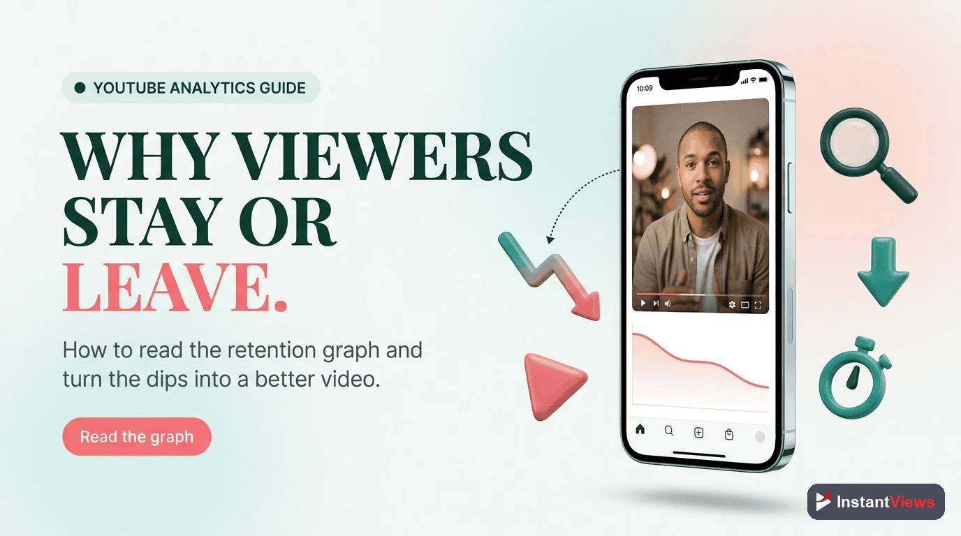
Reading the Audience Retention Graph
The audience retention graph is the most information-dense chart YouTube gives you, and learning to read its shape is what truly separates pros from beginners. The curve shows the percentage of viewers still watching at every second of the video. You are not reading a number here — you are reading a shape.
- The opening cliff: almost every video loses a chunk of viewers in the first 15 to 30 seconds. A gentle slope means your intro earns attention; a steep cliff means your hook is failing and people feel they were misled or bored.
- Flat plateaus: a near-flat line means viewers are locked in. This is exactly what you want through the body of the video.
- Sudden dips: a sharp drop at a specific moment marks something viewers skip or abandon — a long-winded sponsor read, a tangent, or a slow section. These are your edit notes for next time.
- Spikes above the line: when the curve briefly rises, viewers are rewatching or sharing that moment. Study what you did there and do more of it.
Retention is the closest thing YouTube has to honest feedback. Comments are loud but rare; the retention graph reflects what every single viewer actually did. When you find a recurring dip across your videos — say, a slump right after a standard intro animation — fixing that one pattern can lift performance across your whole library.
“Beginners read analytics to feel good about views. Pros read analytics to find the one moment a viewer left — and then they make sure the next video gives them a reason to stay.”
Turn Your Data Into Better Videos
Explore our free suite of YouTube tools to research topics, sharpen your titles, and analyze what is working — so every report in your dashboard turns into a stronger next upload.
Explore Free YouTube Tools →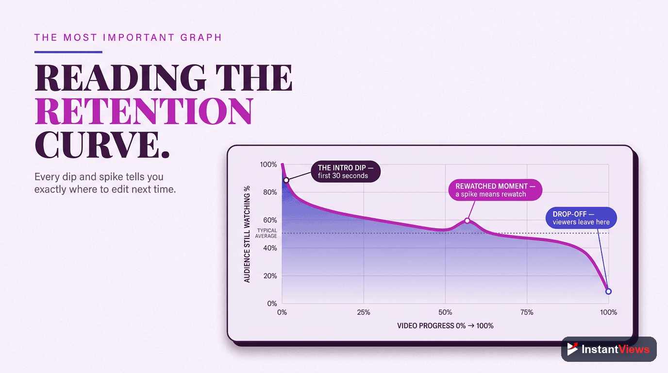
The Audience Tab: Who Is Watching and When
The Audience tab shifts the question from how to who. It tells you exactly who is on the other side of the screen — their age, gender, and geography — and, just as importantly, the balance between new and loyal viewers.
Returning vs. New Viewers
The returning versus new viewers report shows whether you are mostly attracting fresh faces or being rewatched by an existing fan base. There is no single right answer: a channel in growth mode wants a healthy flow of new viewers, while a community-driven channel leans on returning ones. What you want to avoid is being blind to the mix. If returning viewers are climbing, your content is building a habit; if new viewers dominate but never come back, your discovery is strong but your retention or topic consistency may be weak.
When Your Audience Is Online
This report shows the days and hours your subscribers are most active on YouTube. It will not single-handedly make a video succeed — evergreen content surfaces through search and suggestions long after you publish — but for time-sensitive or community videos, publishing a little before a peak gives your upload its best early push, which matters during a video’s critical first hours.
Demographics and Geography
Age, gender, and top countries help you understand whether you are reaching the audience you intended. A sudden shift in top geography, for instance, can explain a change in watch time, since viewing habits, languages, and even peak hours differ by region. Use these reports to sanity-check your assumptions, not to chase a demographic you were never trying to serve.

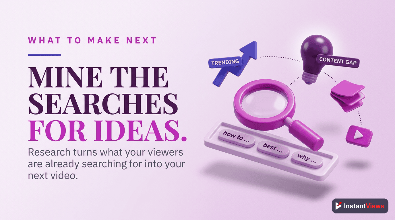
The Research Tab: What to Make Next
Every report so far looks backward. The Research tab is the one that looks forward, and it is the most underused screen in the entire dashboard. Instead of telling you what already happened, it surfaces what your viewers — and the wider YouTube audience — are actively searching for.
You can explore specific search terms, see interest indicators on topics, and spot the gap between what people want and what you have published. That turns analytics from a rear-view mirror into a planning tool. Rather than guessing your next title, you can build it around a topic your own audience has already shown demand for. Pairing the Research tab with your retention insights is powerful: research tells you what to make, and retention tells you how to make it so people stay.
A quick habit: before planning your next batch of videos, spend ten minutes in the Research tab noting three search terms with clear interest that you have not covered well. Those three terms are a content calendar that writes itself, grounded in real demand instead of a hunch.
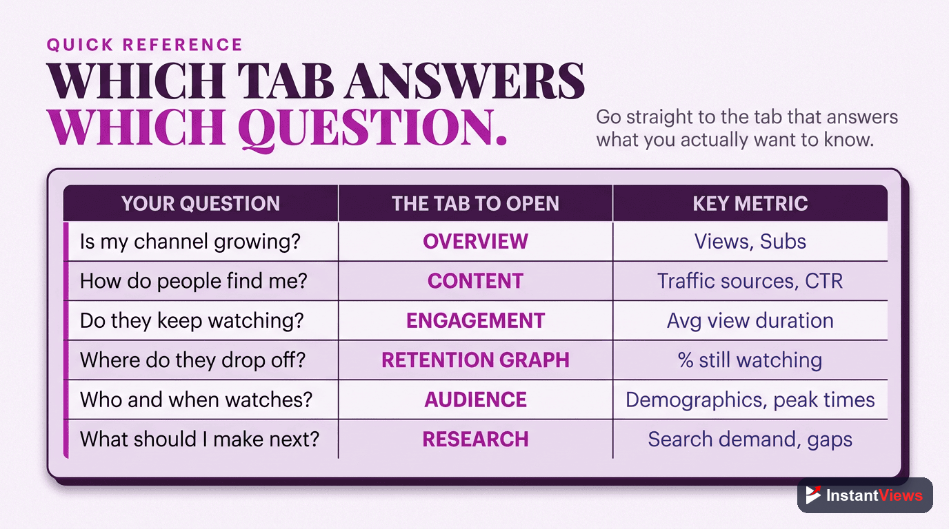
Which Tab Answers Which Question
When you are unsure where to look, this table maps each analytics tab to the reports it holds and the decision it helps you make. Treat it as a cheat sheet you can glance at until the workflow becomes second nature.
| Analytics Tab | Key Reports | What You Learn / Decide |
|---|---|---|
| Overview | Views, watch time, subscribers, top videos, Realtime | How the channel is doing overall and where to look closer |
| Content (Reach) | Impressions, click-through rate, traffic sources | How viewers find you and whether titles and thumbnails earn the click |
| Engagement | Watch time, average view duration, audience retention | Whether your content holds attention and where viewers drop off |
| Audience | Returning vs. new viewers, when audience is online, demographics | Who is watching, how loyal they are, and when to reach them |
| Research | Search terms, topic interest, content gaps | What to make next, based on real audience demand |
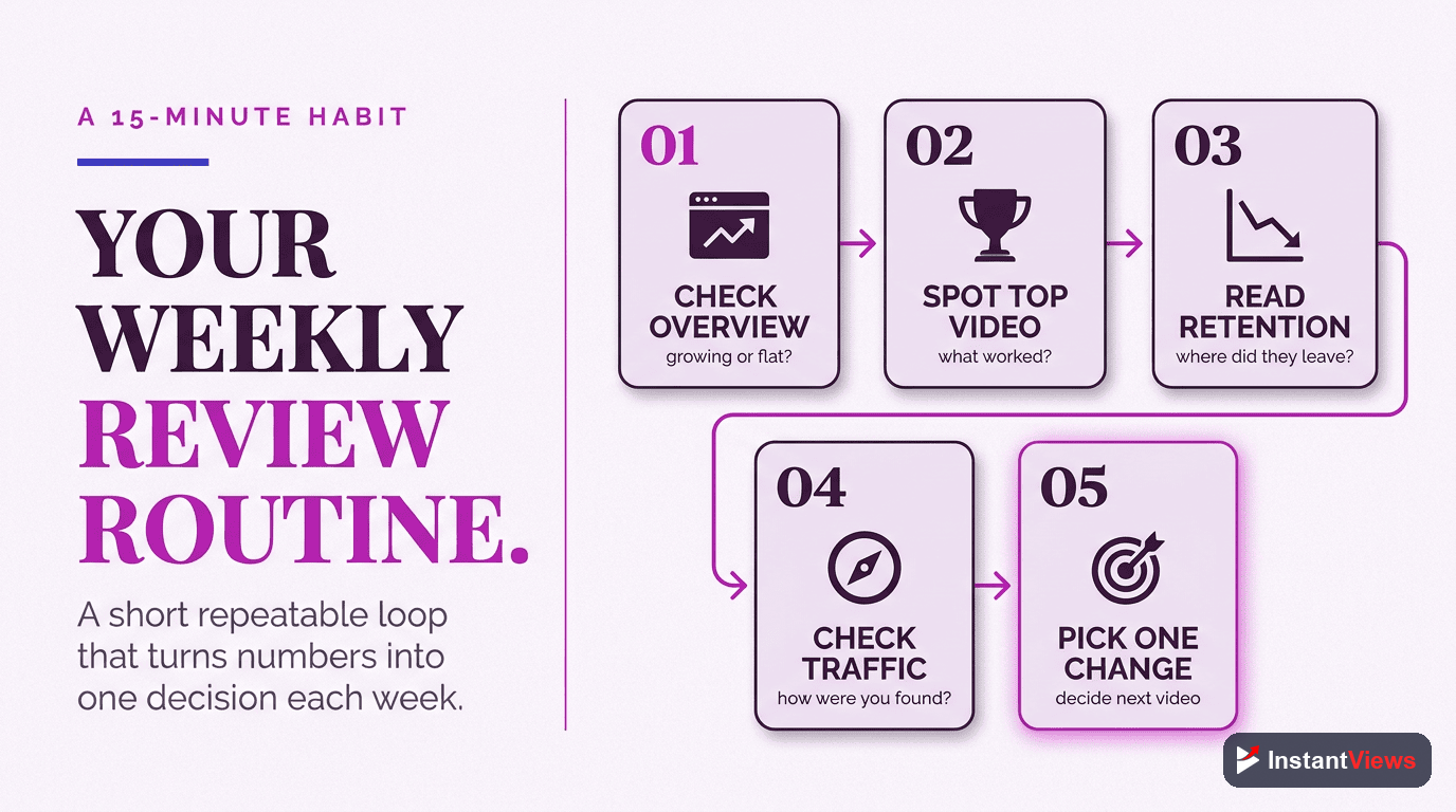
Your Weekly Analytics Review
Knowing the tabs is one thing; building a habit is another. Here is a simple, repeatable review that takes about fifteen minutes and walks the dashboard in the order a pro reads it. Run it once a week or once every two weeks.
Scan the Overview for Anything Unusual
Set a consistent date range, then read views, watch time, and subscribers. Note any video that is over- or under-performing — that is what you will investigate next.
Check How Viewers Are Finding You
Open the Content tab. Look at impressions, click-through rate by traffic source, and the traffic-sources mix. Decide whether your discovery is healthy or whether a title or thumbnail needs work.
Diagnose Retention on Your Latest Video
Open your newest upload’s Engagement report and read the retention graph’s shape. Find the biggest drop-off and write down one specific edit to test next time.
Glance at Your Audience
Check returning versus new viewers and the when-your-audience-is-online chart. Confirm you are building loyalty and reaching people at the right time.
Pull One Idea From Research
Finish in the Research tab. Note one search term with clear interest you have not covered, and add it to your content calendar. End every review pointing forward.
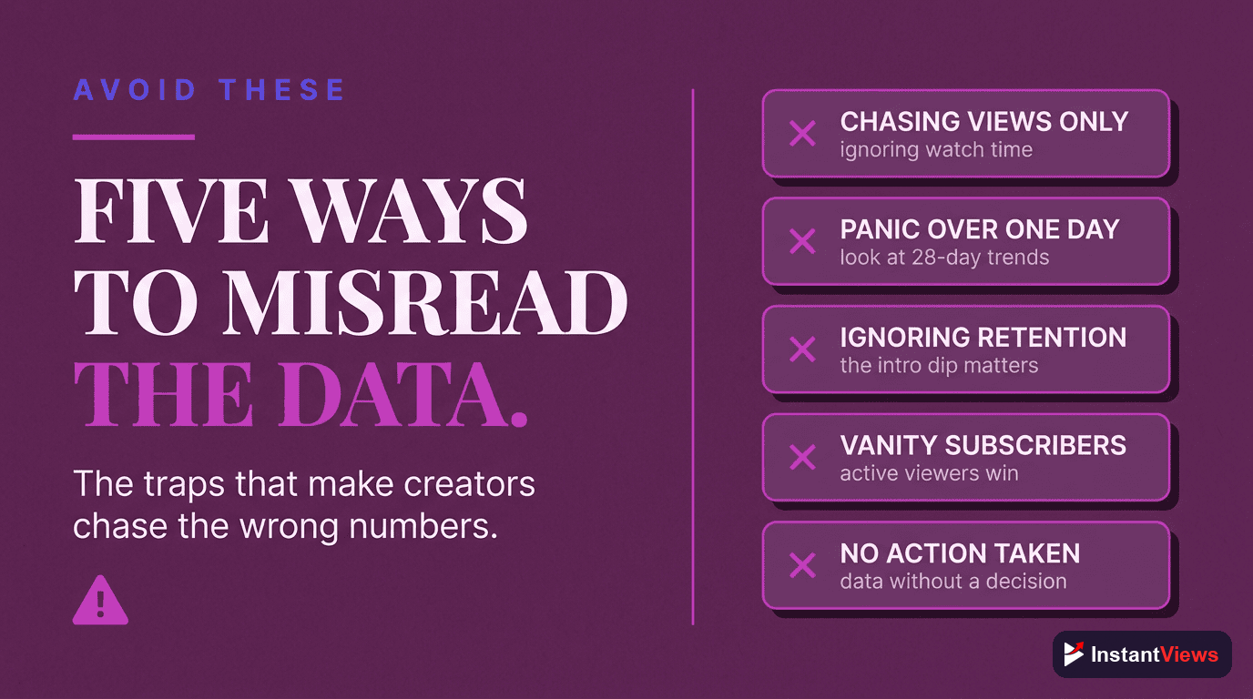
Common Mistakes When Reading Analytics
Even experienced creators misread the dashboard in predictable ways. Watch for these traps:
- Refreshing too often: early numbers are noisy, and the first 24 to 48 hours rarely predict long-term performance. Give videos time before judging them.
- Chasing a universal benchmark: a “good” CTR or retention figure depends on your niche, format, and traffic source. Compare to your own channel average instead.
- Reading only the Overview: the summary hides the cause. The decision-rich detail is always one tab deeper.
- Ignoring traffic source: the same metric means different things from Search, Browse, and Suggested. Always read CTR and retention in the context of where the views came from.
- Collecting data without deciding: the goal is not to know your numbers — it is to change one thing because of them.
- Never opening the Research tab: planning from analytics is where the real leverage lives, yet most creators skip it entirely.
Avoid these and your reviews become genuinely useful. The dashboard is honest feedback from every viewer you have; reading it well is simply the discipline of asking each tab the one question it was built to answer.
Frequently Asked Questions
Open YouTube Studio at studio.youtube.com, then click Analytics in the left-hand menu. From there you can switch between the Overview, Content, Engagement, Audience, and Research tabs. You can view channel-wide data or open any single video and click its Analytics button to see the same reports scoped to that one video.
The core tabs are Overview (a snapshot of views, watch time, and subscribers), Content or Reach (how viewers find you, including impressions, click-through rate, and traffic sources), Engagement (watch time, average view duration, and retention), and Audience (returning viewers, when your audience is online, and demographics). A separate Research tab surfaces what your audience is searching for, and monetized channels also see a Revenue tab.
Across most niches the average YouTube click-through rate in 2026 falls between 2 and 10 percent, and YouTube has historically confirmed that most channels sit inside that range. Rather than chasing one universal number, compare each video to your own channel average and look at CTR by traffic source, since a cold Browse audience naturally clicks at a lower rate than your loyal subscribers.
Watch time is the total number of minutes everyone has watched, so it grows with views. Average view duration is the average amount of each viewing that a single session lasts. Watch time tells you the scale of attention a video earns, while average view duration and the percentage version, average percentage viewed, tell you how compelling the video is regardless of how many people saw it.
The retention curve shows the percentage of viewers still watching at each moment of the video. A steep drop in the first 30 seconds means your intro is losing people, flat sections mean viewers are engaged, and sudden dips mark moments where viewers leave or skip. Spikes that rise above the line indicate parts people rewatch or share, which are clues about what your audience values most.
The Research tab shows what your viewers and the wider YouTube audience are searching for, including specific search terms and topics with interest indicators. It helps you spot content gaps and plan videos around real demand instead of guessing, turning your analytics from a rear-view mirror into a planning tool for upcoming uploads.
A light glance at the Overview tab once or twice a week is plenty for most creators, paired with a deeper review every week or two where you study traffic sources, retention, and audience reports. Avoid refreshing the dashboard every hour after publishing, since early numbers are noisy and the first 24 to 48 hours rarely predict a video long-term performance.
Neither in isolation. The 2026 algorithm optimizes for viewer satisfaction and retention, so a video that holds attention is rewarded more than one that simply collects clicks. Use views and impressions to judge discovery, then use average view duration and retention to judge whether the content delivered on the promise of the title and thumbnail.
Conclusion
Reading YouTube Analytics like a pro is not about memorizing every number on the screen — it is about knowing which tab answers which question. The Overview tells you how you are doing, the Content tab tells you how viewers find you, Engagement tells you whether your videos hold attention, the Audience tab tells you who is watching and when, and the Research tab tells you what to make next. Walk the dashboard in that order and the data starts telling a story instead of just listing figures.
The creators who grow fastest are not the ones who stare at analytics all day. They are the ones who review the right reports on a steady rhythm, ask a clear question of each tab, and let the answers shape one concrete change before the next upload. A weak click-through rate becomes a thumbnail experiment; a steep retention drop becomes a tighter intro; a wave of new viewers becomes a reason to make a sequel.
Open YouTube Studio today and walk through the five tabs with one question in mind for each. Within a few sessions the dashboard will stop feeling like a wall of charts and start feeling like a map — one that points straight at your next, better video.