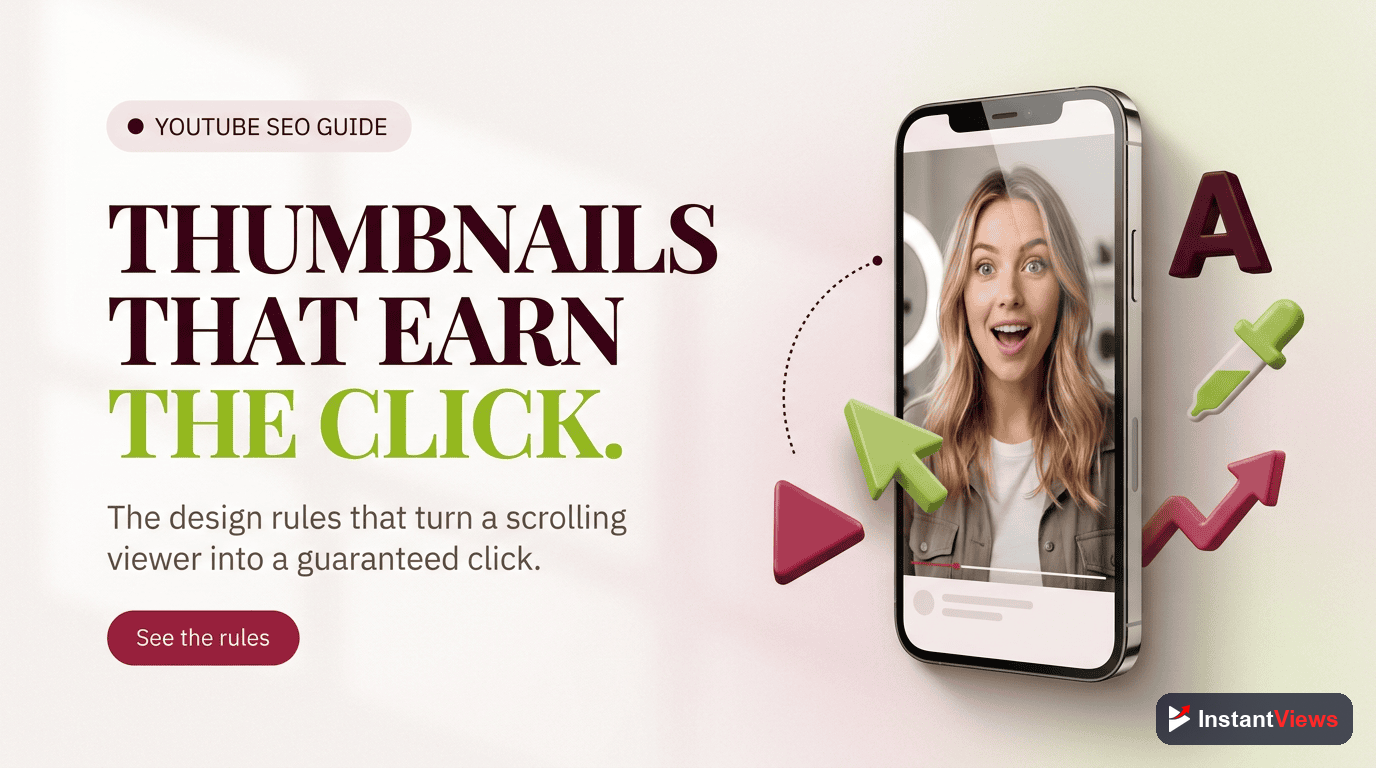
- Design every thumbnail around one clear subject and one idea — clutter is the enemy of the click
- High contrast and a two-to-three color palette are what let a tiny tile cut through a crowded feed
- Keep on-image text to three to five bold words that add to the title rather than repeat it
- Use the rule of thirds, the shrink test, and a consistent brand look to make thumbnails read at any size
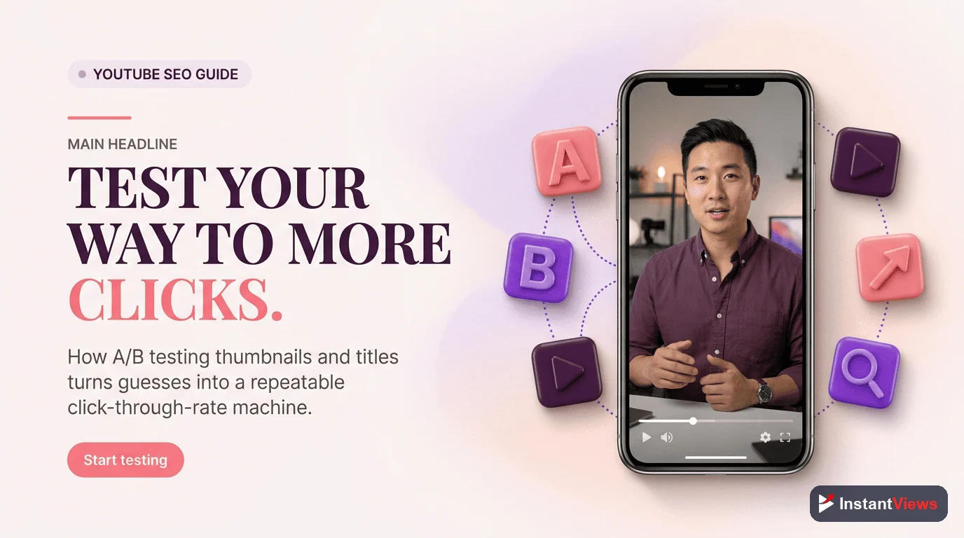
- Let YouTube Studio Test and Compare pick winners by watch time instead of guessing
On YouTube, the thumbnail is the storefront. Before anyone watches a second of your video, they see a small image competing against dozens of others, and in a fraction of a second they decide whether to click. With more than 2.7 billion monthly active users and over a billion hours watched every day, the platform is the largest attention marketplace on earth — and the thumbnail is your bid for a slice of it.
This guide is about the how of thumbnail design: the concrete composition, color, type, and layout choices that turn a flat image into a click-worthy tile. It is the practical, hands-on companion to the question of why thumbnails work psychologically. If you want the reasoning behind curiosity, emotion, and pattern interrupts, read that alongside this; here we focus on execution you can repeat on every upload.
The good news is that great thumbnail design is not an art-school talent — it is a small set of rules. Once you internalize contrast, hierarchy, the rule of thirds, readable text, and mobile legibility, you can build thumbnails that perform consistently instead of hoping one occasionally lands. Let us turn those rules into a playbook you can use today.
Throughout, we will keep one principle front and center: a thumbnail is judged at the size of a postage stamp, not the size of your monitor. Every rule that follows exists to make sure your image survives that shrink and still tells a story at a glance.
- Thumbnail Design Fundamentals
- Composition and the Rule of Thirds
- Contrast and Color That Pop
- Large, Readable Text
- Faces, Expressions, and Subjects
- Mobile and TV Legibility
- Consistency and Branding
- Design Tools and Templates
- Your Step-by-Step Design Process
- A/B Testing Your Thumbnails
- Thumbnail Do's and Don'ts
- FAQ
Thumbnail Design Fundamentals
Before any color or font choice, get the canvas right. YouTube recommends a thumbnail of 1280 by 720 pixels in a 16:9 aspect ratio, saved as JPG, PNG, or GIF, and kept under the 2MB file-size limit. Designing at full resolution keeps the image sharp on large screens, which matter more than ever now that connected TV has become the leading way people watch.
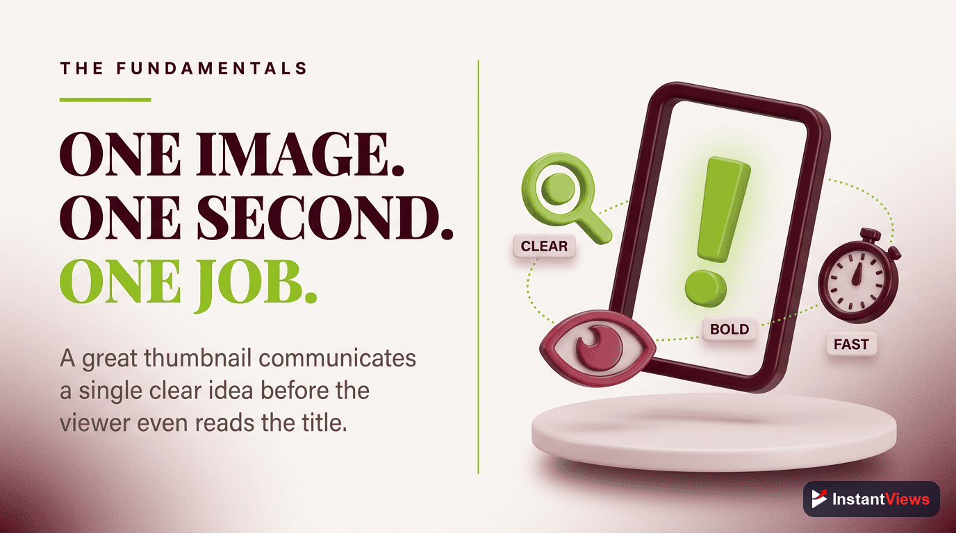
The single most important fundamental is simplicity. High-performing thumbnails in 2026 have converged on a clear look: one dominant subject, two or three colors, and three to five words of text. The reason is structural — the busier an image, the worse it survives being shrunk to a feed tile. Every element you add competes for the same tiny pixel budget.
Three qualities consistently separate strong thumbnails from forgettable ones. Keep them in mind as a checklist for every design:
- Simplicity: one subject, one idea, minimal clutter so the message lands instantly.
- Contrast: clear visual separation between the subject, the background, and the text.
- Emotional impact: a face, a moment, or a phrase that makes a viewer feel something in a glance.
If a thumbnail is missing one of these, it is usually the reason it underperforms. A busy image lacks simplicity; a flat image lacks contrast; a generic image lacks emotional impact. Diagnose your weakest thumbnails against this trio first.
Composition and the Rule of Thirds
Composition is how you arrange elements in the frame so the eye knows where to look. A thumbnail has a natural visual hierarchy: the viewer should register the main subject first, then the supporting text, then any accents — in that order, without effort. If everything shouts at once, nothing is heard.
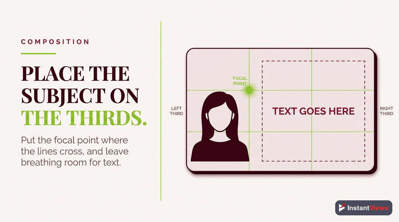
Using the Rule of Thirds
The rule of thirds divides the frame into a three-by-three grid. Placing your key subject on one of the four points where the lines intersect, rather than dead center, tends to create a more dynamic, intentional composition. Both Canva and Photoshop offer a rule-of-thirds grid overlay you can toggle on; turn it on, drop your subject on an intersection, and align your text along a grid line. It takes seconds and immediately makes a thumbnail look deliberate.
Leaving Breathing Room
A common mistake is filling every pixel. Negative space — the empty area around your subject — gives the eye somewhere to rest and makes the subject feel more prominent. A face on the right third with a clean color field on the left, holding two or three words, is a layout that has worked for thousands of channels precisely because it respects this balance.
Contrast and Color That Pop
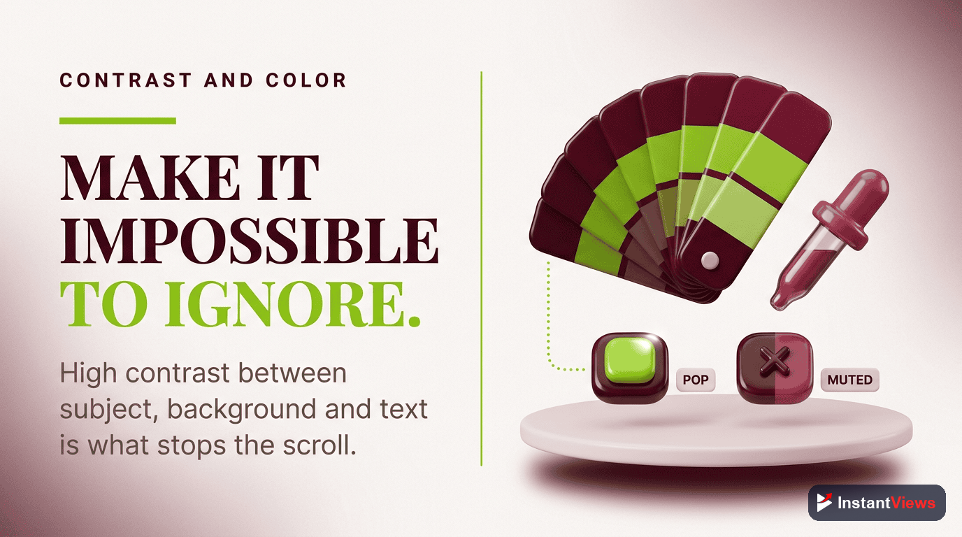
Contrast is the property that lets a small tile cut through a feed full of competing thumbnails. The reliable approach is to pair a bright, saturated color against a darker or neutral background — bright yellow text on deep navy, a vivid red against black, a warm subject against a cool backdrop. That separation is something the eye cannot ignore, even at postage-stamp size.
Complementary Color Pairings
Colors that sit opposite each other on the color wheel produce the strongest separation. Pairings like yellow on violet, red on cyan, or blue on orange give you natural, high-contrast combinations. A practical target is to keep enough contrast that text remains legible even when the thumbnail is reduced to a small tile.
The 60-30-10 Color Framework
A simple framework keeps your palette disciplined: let 60% of the frame be your dominant color, usually the background; 30% be a secondary color, often your subject or an overlay; and 10% be an accent, such as your text or a highlight. Limiting yourself to roughly two or three colors total prevents the muddy, low-contrast look that kills click-through.
Avoid the temptation to use YouTube red as your dominant color — it blends into the platform's own interface. You want to stand out from YouTube, not disappear into it. Reserve loud reds and oranges for accents where they earn attention rather than blanket the frame.
Large, Readable Text
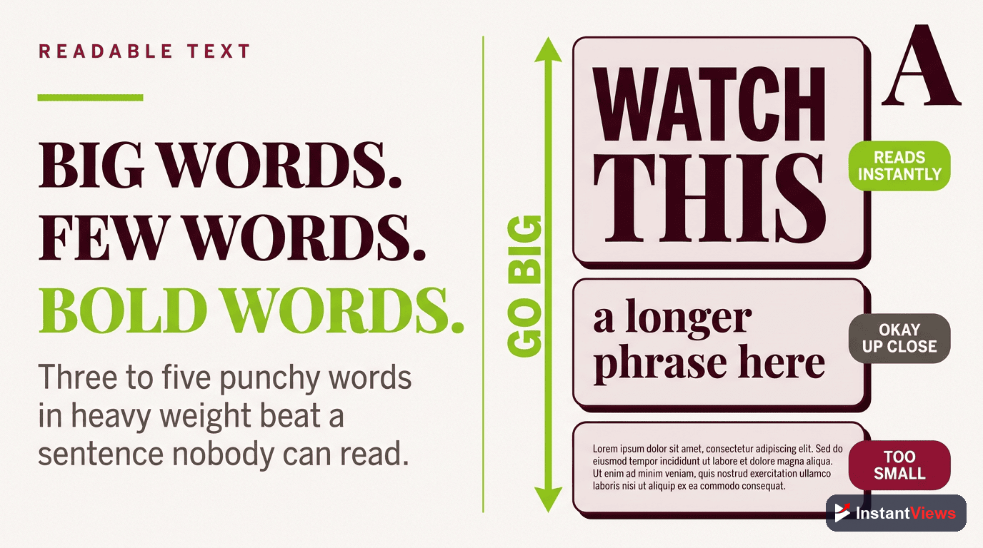
Text on a thumbnail is a hook, not a caption. The rule almost every high-CTR creator follows is three to five words maximum. The thumbnail is read in a glance, and a glance does not have time for a sentence. Your few words should add something the title does not say — a stakes word, a number, a payoff — rather than repeating it.
Typography That Survives Shrinking
Use a bold sans-serif font — weight 700 or heavier — so the strokes stay thick enough to read when small. Let the text occupy a meaningful share of the frame, in the range of roughly a fifth to a third of the image, so it is impossible to miss. Add a white or contrasting outline (a stroke) around the letters so they do not bleed into whatever sits behind them.
- Go bold and heavy: thin and decorative fonts disintegrate at feed size.
- Outline or shadow the text: separate it from the background so it never gets lost.
- One or two words can be huge: size the most important word largest to create instant hierarchy.
- Mind the safe zone: keep text away from the bottom-right corner where the video duration badge sits.
Resist the urge to cram a second line of small text "just to explain more." If it cannot be read at thumbnail size, it is not helping — it is noise that dilutes the words that matter.
Faces, Expressions, and Subjects
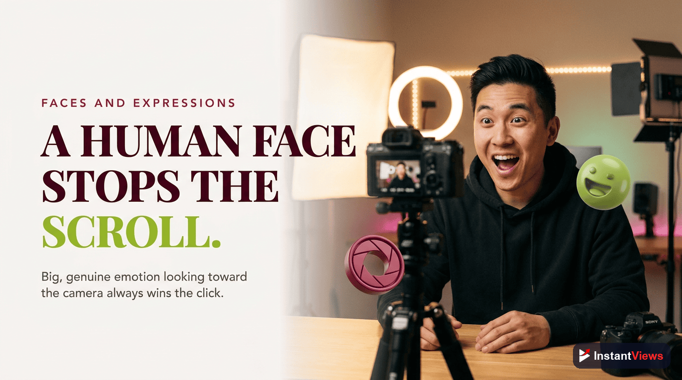
Humans are wired to notice other humans, especially their faces and emotions. A close-up face showing a clear, genuine expression — surprise, delight, concentration, concern — is one of the most reliable ways to create an emotional pull in a glance. That is why faces are a strong default for many creators, particularly in vlog, reaction, education, and commentary formats.
Faces are not mandatory, though. For tutorials, product reviews, listicles, gaming, or finance topics, a clean product shot, a screenshot with a callout, or a bold text-led design can perform just as well or better. The principle underneath is the same: one clear focal subject with an emotional or curiosity hook. Whether that subject is a face, an object, or a phrase depends on your niche.
Getting Expressions Right
- Exaggerate honestly: a slightly heightened expression reads better at small size, but it must still match what the video delivers.
- Cut out the subject: removing the background behind a face or product lets you place it cleanly against a high-contrast color field.
- Direct the gaze: a subject looking toward your text can guide the viewer's eye to it.
- Keep it well lit: a bright, sharp subject always beats a dim, soft one on a small screen.
A thumbnail must honestly represent the video. Exaggerated faces and dramatic text are fine, but a thumbnail that promises something the video never delivers is clickbait — it tanks audience retention and trains both viewers and the system to expect disappointment. The 2026 algorithm rewards viewer satisfaction and retention, so a misleading click works against you.
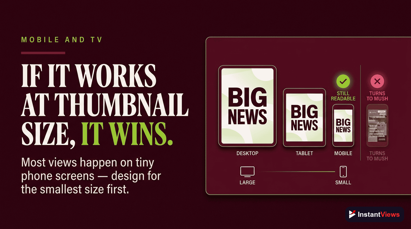
Mobile and TV Legibility
This is the rule that quietly decides whether all your other choices matter. The majority of YouTube watch time happens on phones, where your thumbnail can be reduced to a tile only a couple of hundred pixels wide. Meanwhile connected TV has become the leading viewing surface in some markets, pushing thumbnails to the opposite extreme — large, sharp, and unforgiving of low resolution. Your design has to hold up at both ends.
The Shrink Test
The single best habit you can build is the shrink test: before publishing, view your thumbnail at the size it will actually appear in a mobile feed. If you cannot instantly tell what it is about at that scale, the contrast or the simplicity is not working yet. Designing on a large monitor and never checking it small is one of the most common and costly mistakes creators make.
Practical ways to run the shrink test:
- Zoom your design out until it is roughly the width of a thumb, or preview it on your phone.
- Squint at it — if the subject and main word still register, you are in good shape.
- View it among real competitor thumbnails to see whether it stands out or blends in.
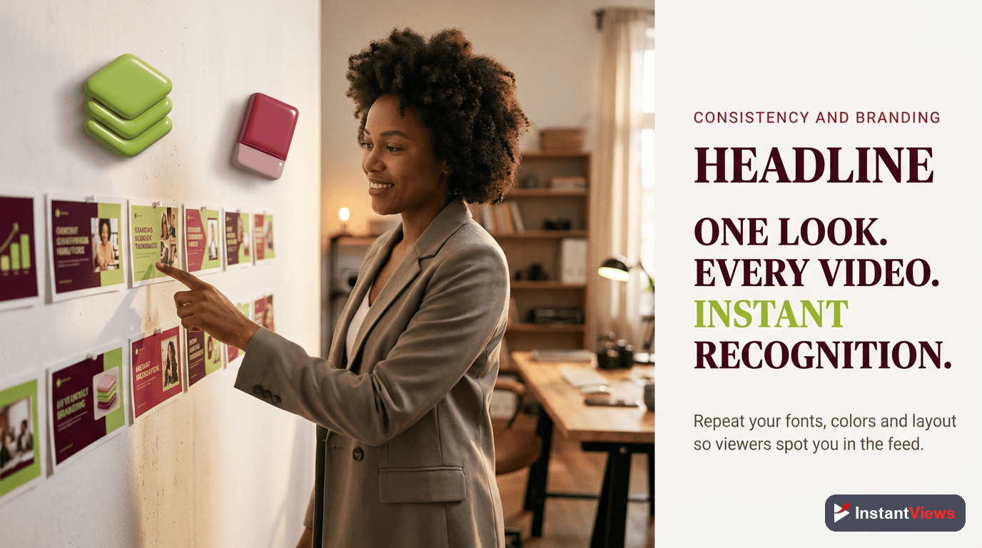
Consistency and Branding
Individual thumbnails earn clicks; a consistent thumbnail style builds a channel. When your thumbnails share a recognizable look — the same font, a signature color, a repeated layout, a logo placement — returning viewers spot your videos instantly in a crowded feed. That recognition is a compounding advantage that no single great thumbnail can match.
Consistency does not mean every thumbnail is identical; it means they belong to the same family. Decide on a small set of brand rules and apply them every time:
- A signature font (one or two, no more) used across all thumbnails.
- A core color or two that viewers begin to associate with you.
- A repeatable layout — for example, subject on the right, text on the left.
- Consistent treatment of cutouts, outlines, and any logo or badge.
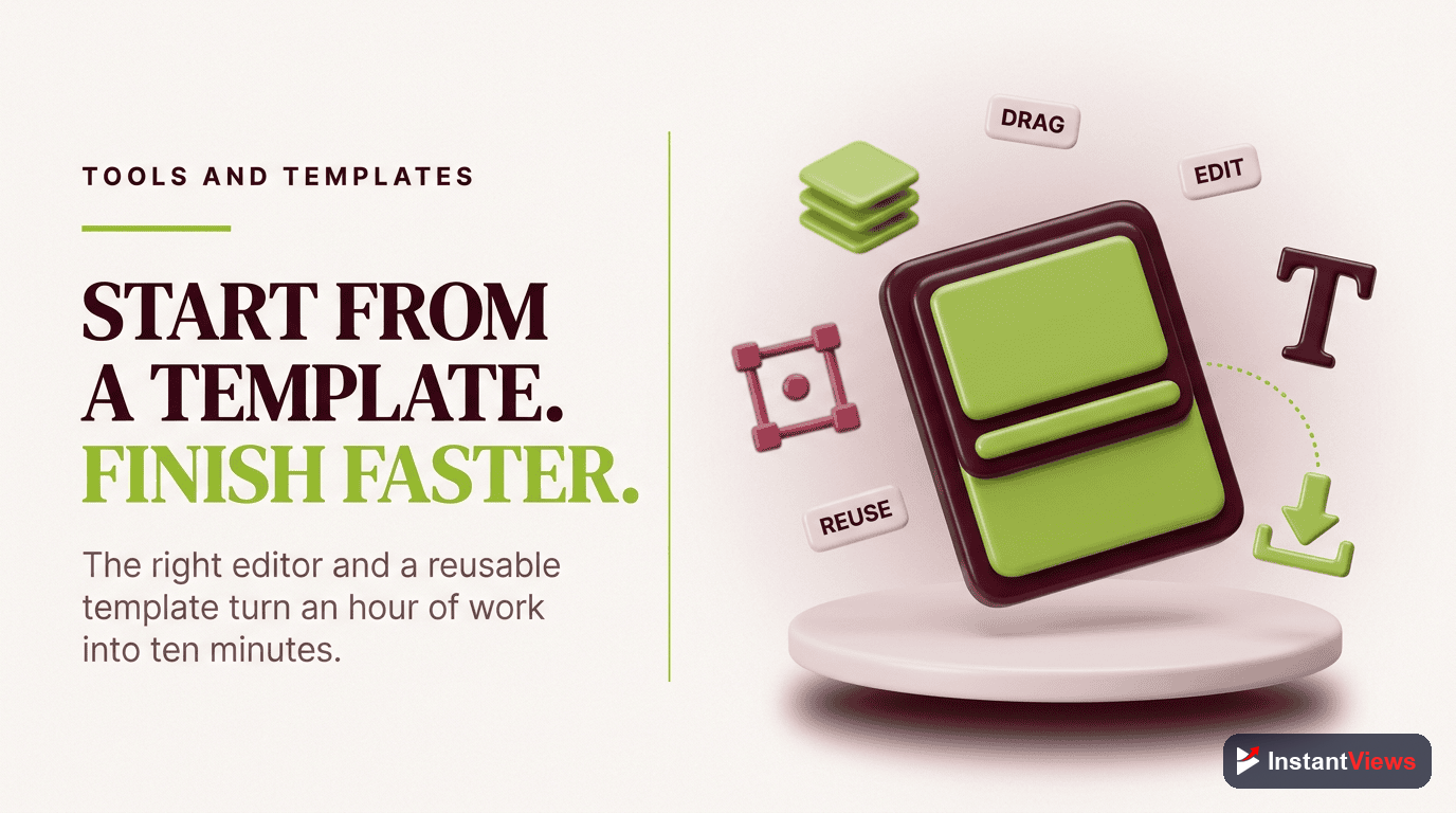
The fastest way to enforce this is a template, which is exactly what the tools section covers next.
Design Tools and Templates
You do not need expensive software to design strong thumbnails. The tool matters far less than the rules you apply with it. Here is how the popular options compare:
| Tool | Best For | Cost | Standout Feature |
|---|---|---|---|
| Canva | Beginners and fast templates | Free / paid tier | Templates, rule-of-thirds grid, one-click background removal |
| Photoshop | Advanced, pixel-level control | Subscription | Precise masking, layer styles, grid overlays |
| Affinity Photo | Pro editing without subscription | One-time purchase | Full editor with a single up-front cost |
| Figma | Reusable component templates | Free / paid tier | Shared, swappable design components |
Whichever you choose, build a master template once and reuse it. A good template locks in your safe margins, your font, your color zones, and a placeholder for your subject and text. With it, a new thumbnail becomes a five-minute swap rather than a from-scratch design — and your branding stays consistent automatically.
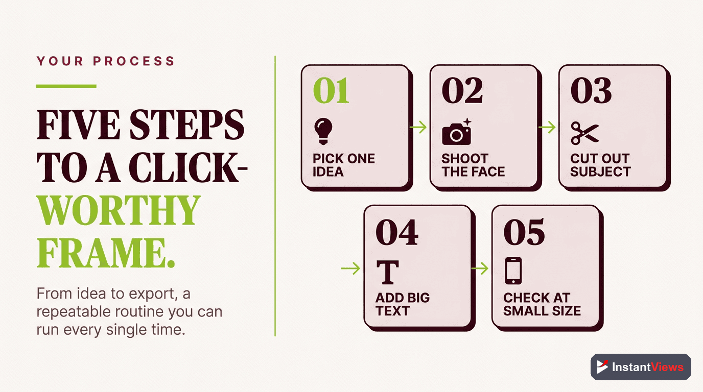
Your Step-by-Step Design Process
Pulling the rules together, here is a repeatable process you can run for every video:
Pick One Subject and One Idea
Open a 1280 by 720 canvas and decide the single subject and the one idea the thumbnail must convey. If an element does not support that idea, it does not belong in the frame.
Set Contrast and Palette
Choose a bright subject or accent against a darker or neutral background, and limit yourself to two or three colors using the 60-30-10 split so the tile stays clean.
Compose With the Grid
Turn on the rule-of-thirds overlay, place your subject on an intersection, leave breathing room, and reserve a zone for text.
Add Bold, Outlined Text
Drop in three to five words in a heavy sans-serif with a contrasting outline. Size the most important word largest and keep text out of the duration-badge corner.
Shrink-Test and Compare
Preview it tiny to confirm it reads, check it beside competitor thumbnails, then run your best two or three versions through A/B testing and keep the winner.
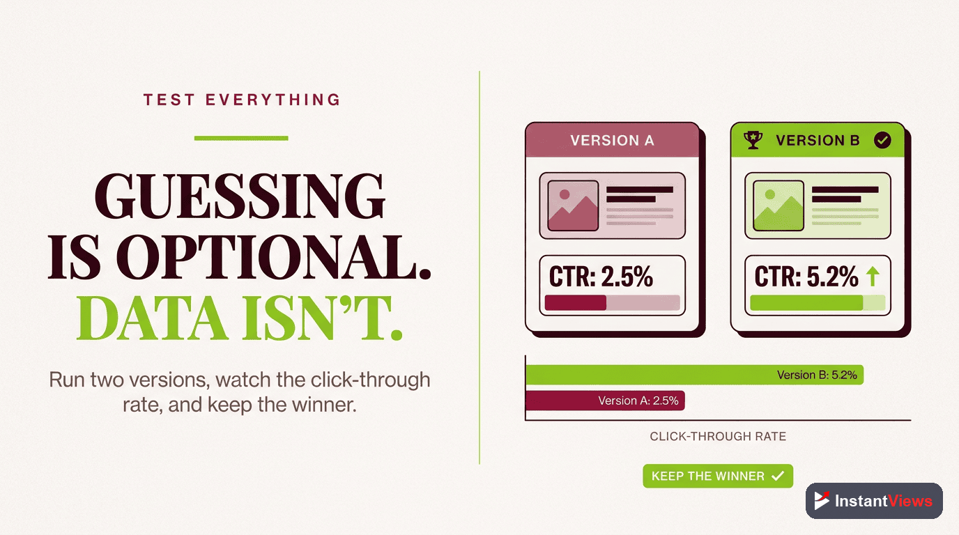
A/B Testing Your Thumbnails
Design rules get you a strong starting point, but data decides the winner. YouTube Studio now includes a native Test and Compare feature that lets you pit up to three thumbnails against each other on a published video. YouTube serves each option to a share of your audience and, after roughly one to two weeks and enough impressions, keeps the version with the best watch-time share — not clicks alone.
A few practical notes on how it works today:
- Up to three options: you can test thumbnail only, title only, or title and thumbnail together.
- It is set up in YouTube Studio on desktop, and you need advanced features enabled to be eligible.
- Shorts, scheduled lives, and premieres are not eligible at this time.
- Results live on the video's details page and in the Reach tab of its analytics.
Because the winner is chosen on watch time, this feature quietly enforces the honesty rule: a thumbnail that earns clicks but loses viewers will lose the test. Test meaningfully different ideas — a face versus a product, two distinct color schemes, two different hook words — rather than tiny tweaks, so you actually learn what moves your audience.
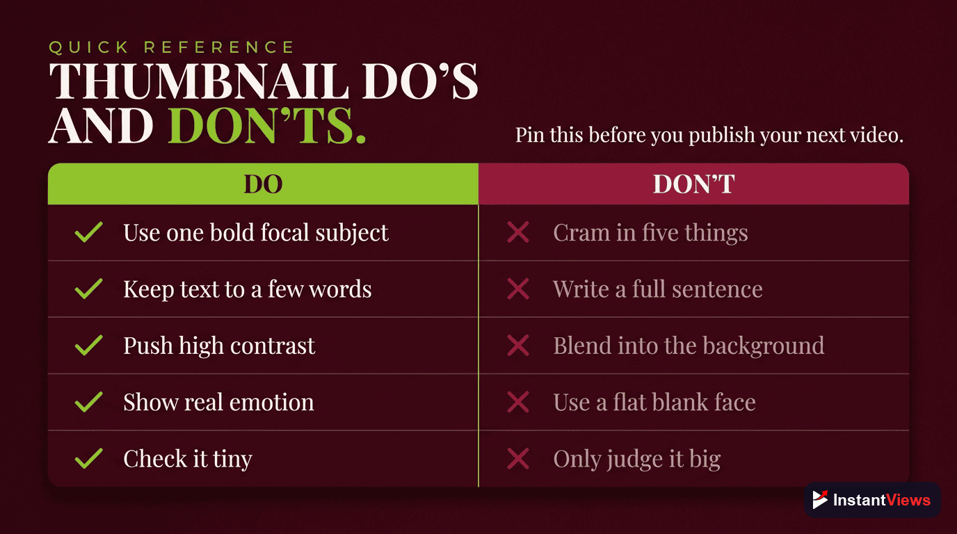
Thumbnail Do's and Don'ts
Use this quick reference as a final check before you publish:
| Do | Don't |
|---|---|
| Feature one clear subject and one idea | Crowd the frame with multiple competing elements |
| Use high contrast and two to three colors | Use flat, low-contrast color or YouTube red as the background |
| Keep text to three to five bold words | Write full sentences or tiny captions nobody can read |
| Add the idea the title does not say | Repeat the exact title text on the image |
| Run the shrink test on every thumbnail | Judge the design only on a large monitor |
| Keep a consistent brand style and template | Reinvent the look from scratch every time |
| Represent the video honestly | Promise something the video never delivers |
"A thumbnail does not need to be clever — it needs to be clear. One subject, bold contrast, a few honest words, and a look that is unmistakably yours will out-click a beautiful image nobody can read at the size of a thumb."
Frequently Asked Questions
YouTube recommends an image of 1280 by 720 pixels with a 16:9 aspect ratio, saved as JPG, PNG, or GIF and under the 2MB limit. Designing at full resolution keeps your thumbnail crisp on large screens, but you should always preview it at a tiny size because it has to read clearly there too.
Keep on-image text to three to five words at most. The thumbnail is a glance, not a sentence. A short, bold phrase that adds something the title does not say works far better than a caption that nobody can read at feed size.
Most YouTube watch time happens on phones and increasingly on connected TVs, where your thumbnail is reduced to a small tile. Fine detail, thin fonts, and busy backgrounds vanish at that scale. Always design with the shrink test in mind: if it is not instantly readable as a thumbnail-sized tile, simplify it.
Lean on contrast. Pair one bright, saturated color against a darker or neutral background, keep to two or three colors total, and feature a single clear subject. High contrast is what lets a small tile cut through a crowded feed of competing thumbnails.
Faces with a clear emotion tend to draw attention because people are wired to notice expressions, so they are a strong default for many channels. They are not mandatory, though. For tutorials, product, or text-driven topics, a clean subject with bold text can perform just as well. Test both rather than assuming.
YouTube Studio includes a native Test and Compare feature that lets you test up to three thumbnails on a published video. YouTube serves each option to a share of viewers and, after roughly one to two weeks, keeps the one with the best watch-time share. It is currently set up in YouTube Studio on desktop and is not available for Shorts.
Canva is the most popular free starting point because of its templates, rule-of-thirds grid, and one-click background removal. Photoshop and Affinity Photo offer more control for advanced editing. The tool matters far less than applying the design rules: contrast, one subject, big text, and a consistent brand look.
Psychology explains why a thumbnail earns a click, such as curiosity, emotion, and pattern interrupts. Design is the how: the composition, color, type, and layout choices that put those triggers on screen clearly. This guide focuses on the design execution, so the two work best read together.
Conclusion
A great thumbnail is not the product of a single lucky idea — it is the result of repeatable design rules applied every single upload. One clear subject, two or three high-contrast colors, three to five words of bold text, smart placement with the rule of thirds, and a look that is unmistakably yours: get those right and your thumbnails will read clearly in any feed, on any screen.
Start where the impact is biggest. Build one simple template you can reuse, design at full resolution but always judge your work at thumbnail size, and lean on contrast so the tile survives the shrink down to a phone screen. Then let the data decide: run your strongest two or three options through Test and Compare and keep what earns the most watch time.
Design is the visible half of the click; the psychology of what makes viewers curious is the other half. Pair the rules in this playbook with a clear, honest promise that your video delivers, stay consistent, and your channel will turn more of its impressions into the views it deserves.